Project management tools like ClickUp and Notion allow you to organize your notes and documents, assign tasks to team members, and improve your productivity.
While there are many project management tools on the market, ClickUp and Notion are two of the most popular.
Which one is right for you, however?
Today, I will be comparing ClickUp and Notion for things like:
- Project management
- Document management
- Assigning tasks
- Taking notes
- Communicating with your team
- Organizing your to-do list
- And more!
At the end of this article, you will have a pretty clear idea of whether ClickUp or Notion is the best choice for you, based on your needs. Let’s get into it.
ClickUp Vs Notion: The Basics
What Is ClickUp?
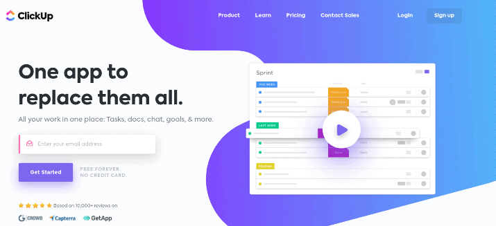
ClickUp is a productivity and project management software. The team at ClickUp aims to help people save up to 20 percent of their workweek by using the platform.
ClickUp is also great for team collaboration. You can create mind maps, track working time, send emails, assign tasks, create deadlines, and a lot more.
There is a free plan available, and there is even free training on how to use the platform. ClickUp has received several “best software” awards.
ClickUp makes project management easier. You can set up to-do lists, docs, spreadsheets, email, events, reminders & more. With ClickUp, time tracking and resource management gets simpler too. Try it today!
What Is Notion?
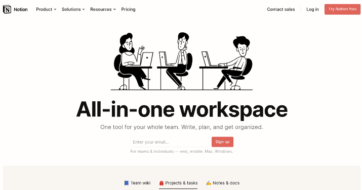
Notion is best described as an application for writing notes and creating a personal wiki. You can create notes from scratch, make a to-do list, organize documents, manage your projects, and a lot more.
However, Notion also offers team collaboration features, just like ClickUp. You can add team members to your account, so they can view boards, add comments, and so on.
I’ll talk more about team collaboration and how ClickUp and Notion compare in that regard later in this article.
Notion is also free to use, though paid plans are available too.
It’s interesting to note that both ClickUp and Notion are based in California.
Notion vs ClickUp: First Steps & Getting Started
ClickUp
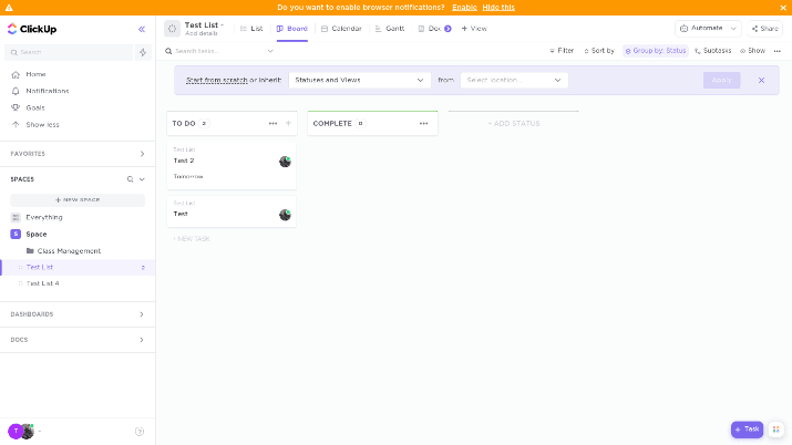
To get started with ClickUp, just create a free account and answer some questions about what you will be using it for. You’ll be taken to your first “space,” an online workspace where you can create to-do lists, task boards, and more.
To get started, create a to-do list. You can add as many items as you want to the list.
For each task on the list, enter a name, assignee, and due date. While those are the three main fields available by default, you can also add other fields to a task by clicking on the + sign.
Fields you can add include:
- Comments
- Date closed
- Date updated
- Date created
- And more
When creating future lists in new spaces, you will be able to transfer list properties from a previous list to your new list.
By default, your to-do list will show up in a list format, but you can also change it to a board format. These different formats are called “views.”
By default, the two main columns in the board view will be “To Do” and “Complete,” but you can add additional columns as well and color code them to stay organized.
You will be able to create new tasks under different columns and drag and drop tasks from one column to another.
In addition to lists and boards, you can also switch to some other views, which I will talk about in the next section.
Notion
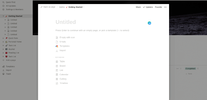
Getting started with Notion is pretty simple as well. In the Getting Started board, you’ll be able to create a blank note or choose from several views/formats, such as lists and boards.
If you choose the board format, you’ll see several columns that are color-coded — you just need to add a title to the board and to each column.
You can then add tasks and drop and drop them from one column to another.
Let’s talk a bit more about the different views you can choose from on Notion or ClickUp.
ClickUp vs Notion: Views
ClickUp
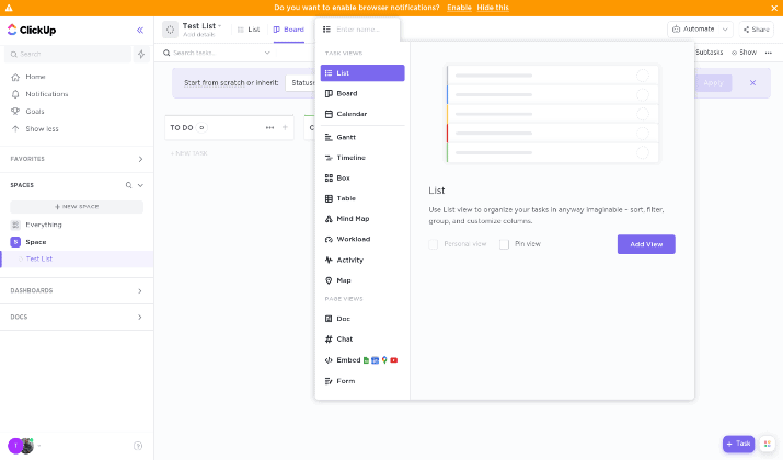
I already talked about the two main views in ClickUp: lists and boards. It might not be obvious at first, but you can change your space to a different view by clicking on the “+ View” option at the top left-hand corner of your space.
Once you do that, you will see the other views you can add. Let’s take a look at your options here:
- Calendar
- Gantt
- Timeline
- Box
- Table
- Workload
- Activity
- Map
Each view serves a different purpose.
For example, the calendar and Gantt views are great for visualizing your schedule based on date. The workload view helps you get a quick overview of your entire team and what each member’s workload is, so you can see who is underworked and who is overworked.
ClickUp makes project management easier. You can set up to-do lists, docs, spreadsheets, email, events, reminders & more. With ClickUp, time tracking and resource management gets simpler too. Try it today!
Almost all the views are available on the free plan.
Up until now, we have talked about task-based views. All the above-mentioned views provide different ways to visualize tasks, workloads, projects, and so forth.
In addition to task views, however, there are a few other views that have nothing to do with tasks. For example, the document view allows you to write an article in your space, with advanced formatting options, almost like in Google Docs.
You can add a chat view to set up a group chat, and you can also embed apps such as a Google Sheet or a Google Doc.
Finally, you can use the form view to create a form that people can fill out. It’s a great way to collect important information.
You can switch between different views on the same board. For example, if you create a task in a list view and then switch over to a board view, the same task will show up again, just in a different view.
If you add a due date to the task, it will also show up in the calendar view.
In other words, if you want to create an entirely new list with a different view, you will have to create a new folder in the same workspace or an entirely new workspace.
Notion
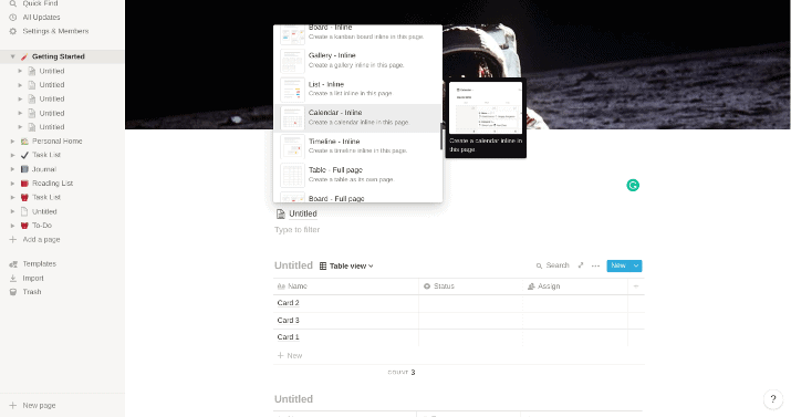
Notion also has a good selection of views to choose from. In addition to a blank view, where you write a note from scratch, the following views are available:
- Table
- Board
- Timeline
- Calendar
- List
- Gallery
One thing I liked about Notion is that it allows you to add multiple views to the same page. In other words, you can add a list view, make a to-do list, and then add a calendar view underneath it, all on the same page.
Each view can have different tasks, even on the same page. Just make sure you are adding a new block to the page (click on the + icon on to the left of the block) and not simply changing the view of your current block to another view.
You’ll notice that ClickUp has more views to choose from. For example, Notion doesn’t have a form view, but you can add forms with a third-party app, Notion Forms.
Notion vs ClickUp: Templates
In addition to views, both ClickUp and Notion have templates. The difference between views and templates is simple.
While views change the way you visualize tasks, they still present you with a blank slate. It is your job to add tasks, fields, etc.
However, templates are designed for specific use cases — for example, there might be a template for Meeting Notes or Construction Management. They come with premade tasks and fields — you just have to add your own data.
ClickUp
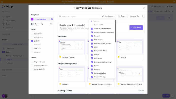
ClickUp has over 120 templates to choose from, ranging from simple templates to more advanced ones. Here are some examples of templates available on ClickUp:
- Simple Project Management
- Project Management
- Simple To-Dos
- Task Management
- Construction Management
- Getting Things Done
- Roadmap
- Bug Queues
- Class Notes
- Student
- Class Management
- Class Planning
- Graphic Design
- Architectural Design
- Commission Tracking
- Podcasting Template
- Social Media Posts
- A/B Testing
There are many more. To find the template you want to use, you can filter the results based on use case, as you can see in the screenshot above.
ClickUp makes project management easier. You can set up to-do lists, docs, spreadsheets, email, events, reminders & more. With ClickUp, time tracking and resource management gets simpler too. Try it today!
The point of using a template instead of simply choosing a view is that the template will give you premade tasks, fields, and more based on your needs. For example, look at this class management template:
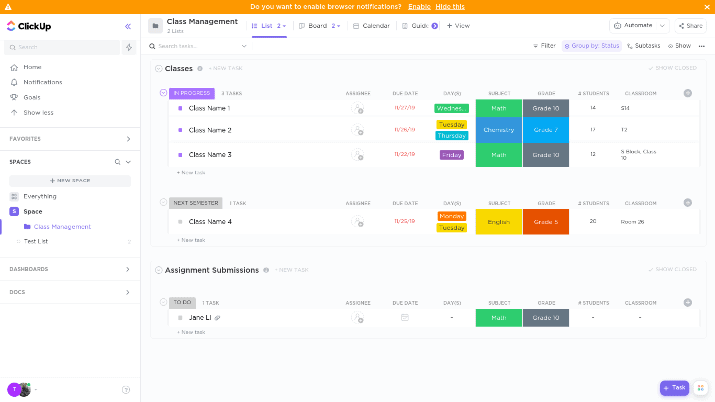
All you have to do is change the class name, assignee, subject, grade, etc. You can also add rows in addition to the ones that are already there.
You can also customize a template while importing it.
Notion
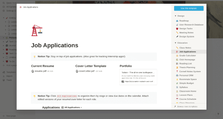
Overall, Notion does not have nearly as many templates as ClickUp does. However, it still has a decent number — I counted around 60-70.
One thing I liked a lot was the “quick templates” you can choose from the left-hand menu. You can also think of these quick templates as personal wikis — little spaces for organizing your everyday life.
They include:
- Personal Home
- Task List
- Journal
- Reading List
For example, in the Personal Home template, you will see several subsections ready-made for you: Movie List, Recipes, Yearly Goals, and Travel Plans.
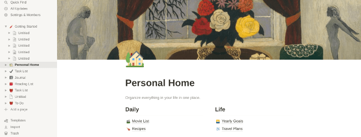
You can add additional subpages and build up your personal wiki.
To find more templates, go to the Templates option in the left-hand menu. There are nine main categories, including sales, education, personal, product management, support, and more.
They include templates like:
- Class Notes
- Grade Calculator
- Job Applications
- Personal CRM
- Roommate Space
- Simple Budget
- Meeting notes
- Applicant Tracker
- Journal
- Travel Planner
- Reading List
- Habit Tracker
- Weekly Agenda
- Team Directory
The templates are easy to use, and many are useful for everyday purposes, such as creating a budget or sharing tasks and bills with roommates.
ClickUp vs Notion: Ease Of Use & UX
In this section, I’ll compare ClickUp and Notion for ease of use and user experience.
ClickUp
While ClickUp is not terribly difficult to use, it loses to Notion in terms of UX and beginner friendliness.
There are just a lot of options available that can get confusing when you first create an account. Over time, you will learn how to use ClickUp and navigate it, but it requires a bit of a learning curve.
ClickUp also has a buggy interface that can be slow at times. Many times, when trying to load the application, you will simply see the logo for 10 seconds or more as the application loads.
That can be incredibly frustrating when you are in a rush or do not have a lot of time. Also, certain spaces and folders can take a while to load, and the application can be sluggish overall.
Notion
If you’re comparing the two platforms solely in terms of UX and beginner friendliness, I’d stick with Notion. It’s easier to use, and it is also less buggy.
Notion has a lot of white space, and the interface, while simple, is more pleasing to the eye. There are fewer options that distract and confuse you, and it’s easy to figure out how to add a new view to a page or how to select a template.
Yes, ClickUp might be a bit more advanced and it does offer features that Notion does not. However, Notion requires less of a learning curve, and it’s a better choice for those with basic project management needs or few technical skills.
Notion vs ClickUp: Personal Organization & Notes
If all you need is an application for organizing your personal life and tasks and jotting down notes, is Notion or ClickUp a better choice? In the next section, I’ll talk about team collaboration, but let’s focus on personal use for now.
ClickUp
ClickUp is not bad for personal organization, but it might be a bit over the top. Most people don’t need all the features it offers, and the user interface can also be a bit confusing.
Notion
For organizing your life, creating to-do lists, writing down notes, and simple personal project management, I’d choose Notion over ClickUp.
Sure, ClickUp does allow you to write notes by choosing the “doc” view, but it’s not meant primarily for taking notes.
Notion, on the other hand, allows you to write notes on blank spaces. You can add multiple views to a page, add a to-do list under a note, and add a calendar under the to-do list.
ClickUp vs Notion: Team Collaboration
On the other hand, if you need a project management tool for your team, is Notion still the best option for you?
ClickUp
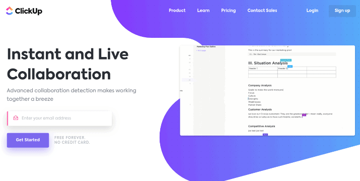
ClickUp is better for team collaboration. Everything is streamlined to help teams save time and be more productive — ClickUp claims it helps teams save one day a week.
You can assign tasks, set due dates, create public chats for the whole team and private chats with specific members, comment on tasks, tag people in comments, and a lot more! You can also assign roles and grant permissions (but not on the free plan).
ClickUp makes project management easier. You can set up to-do lists, docs, spreadsheets, email, events, reminders & more. With ClickUp, time tracking and resource management gets simpler too. Try it today!
To help team members be more productive and get things done, you can set time estimates for each task and then track the actual time spent on the task.
As I mentioned before, there are even views that help you visualize your team members’ workloads. Not only that, but you can quickly track your team members’ activity and view their progress at a glance using the interactive progress reports.
There are a lot of templates designed for team productivity specifically.
Another thing I liked was the ability to set goals and tie specific tasks to those goals. That helps the team work together to achieve them.
Also, with the real-time collaboration detection that ClickUp has, every team member will be able to see what others are doing in real time. For example, they’ll be able to see that another team member is currently adding a comment or editing a task’s description.
Finally, ClickUp has some awesome automation features and apps, which I will talk about in the next section. They make ClickUp great for collaboration as well.
Notion
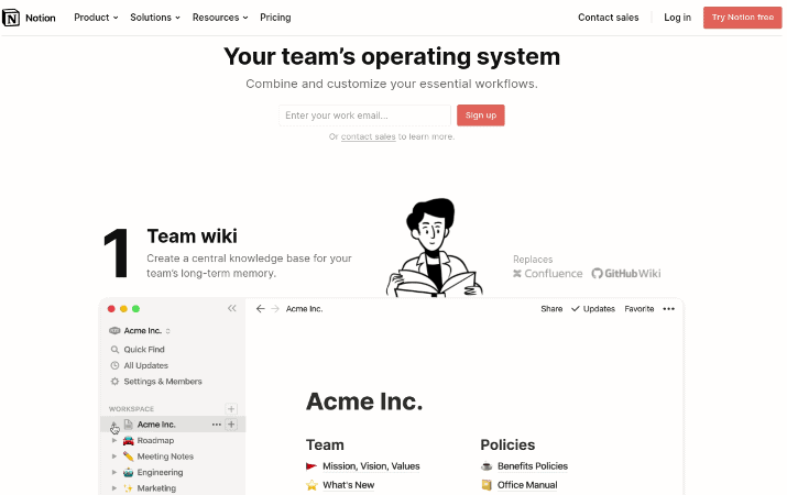
Notion does have a plan for teams as well. However, it’s still better used as a personal wiki or project management application than a team collaboration app.
Still, Notion is good for some things, especially if you have a smaller team or only need it for specific team collaboration purposes.
For example, you can set up a team wiki with documentation on how to use your software or what your company guidelines and visions are. In addition, you can create shared boards or create a list of shared documents and notes.
Actually, in terms of team wikis and document databases, I’d say Notion actually wins. ClickUp is okay too, but Notion is better for document databases.
Also, since Notion is a bit easier to navigate, some of your team members might have a more difficult time getting used to ClickUp.
Still, Notion just does not compare to ClickUp when it comes to team collaboration — ClickUp has more features overall.
Notion vs ClickUp: Automation
ClickUp
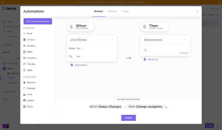
ClickUp has built-in automation recipes to make your life easier, and you can also set up your own custom automations. It integrates with tools like Twilio, Calendly, and popular email clients for automation.
Some automation recipes include:
- When the status of an assignment changes, automatically reassign it to a new member (for example, once it’s ready to be edited, assign it to an editor)
- Reassign the priority value of a task when it is reassigned
- When the priority changes, change the template
- Send an email when the due date arrives
- When a task is moved, send an SMS message
Also, ClickUp has ClickApps, which include screen recording and the ability to nestle subtasks within a task for optimized organization.
Notion
Notion recently released a public API, which means you can now integrate it with other tools and set up automations. You can use third-party tools that are not affiliated with Notion, including Notion Automations and Automate.io, to set up automation workflows using the API.
Still, ClickUp wins in terms of automation due to its built-in automation capabilities.
ClickUp vs Notion: Pros & Cons
ClickUp Pros
- It has a free plan.
- It has awesome team collaboration features, including live collaboration.
- There are built-in automation recipes.
- Using ClickApps, you can enable additional features, such as subtasks.
- It has 120+ templates.
ClickUp Cons
- The app can be a bit slow and buggy at times.
- It requires a bit of a learning curve.
- You can’t add multiple views to the same page.
- It’s not an open source project management tool.
Notion Pros
- It has a free plan.
- It is very beginner-friendly and has an interface that is incredibly easy to use.
- Notion is great for personal wikis and life management.
- You can add multiple views to a single page.
Notion Cons
- Team collaboration features could be better.
- You need to use the API or rely on third parties for automation.
- It does not have as many templates as ClickUp.
- It is not open source.
Pricing
ClickUp
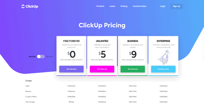
ClickUp’s free plan lets you create up to five spaces and an unlimited number of tasks, but you only get 100 MB of file storage space. Also, when you grant guests access to your boards, you must give them full access; you can not create custom permissions on the free plan.
Other limitations include only 100 automations per month.
ClickUp makes project management easier. You can set up to-do lists, docs, spreadsheets, email, events, reminders & more. With ClickUp, time tracking and resource management gets simpler too. Try it today!
Premium plans are as follows:
- Unlimited: $5-9/month per member
- Business: $9-19/month per member
- Enterprise: Custom
If you pay yearly, you will pay the lower price per month. If you pay monthly, you will pay the higher price.
The Business plan gives you additional perks, such as 10,000 automations per month vs 1,000 and the ability to create goal folders. To see the full comparison between plans and for updated pricing information, check out the ClickUp pricing page.
Notion
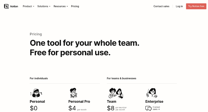
Notion’s free Personal plan will be sufficient for most people using Notion for personal use, but its Personal Pro plan, which starts at $4/month, will give you perks like unlimited file uploads.
For teams, pricing starts at $8/month per team member, which is more expensive than ClickUp’s starting price for teams. There is also a custom Enterprise option.
Check out the Notion pricing page for more information.
Similarities And Differences
| ClickUp | Notion | |
| Multiple Views To Choose From | ✓ | ✓ |
| Add More Than One View To A Page | ✗ | ✓ |
| Templates | ✓ | ✓ |
| Built-In Automation | ✓ | ✗ (Third Party Required) |
| Built-In Forms | ✓ | ✗ (Third Party Required) |
| Simple & Easy To Use | ✗ | ✓ |
| Team Public & Private Chats Channels | ✓ | ✗ |
| Mobile Apps | ✓ | ✓ |
| Free Plan | ✓ | ✓ |
Wrapping It Up: Which Is Better, ClickUp Or Notion?
That depends on what your needs are. For team management and collaboration, always go with ClickUp — you will get more done, and it can be cheaper, depending on the plan you choose.
However, for personal note-taking and organizing your life, just stick with Notion. It’s easier to use.
Tom loves to write on technology, e-commerce & internet marketing.
Tom has been a full-time internet marketer for two decades now, earning millions of dollars while living life on his own terms. Along the way, he’s also coached thousands of other people to success.
