Your email signature is a crucial part of your email message, whether you’re a regular professional engaged in everyday communications or a brand sending out sales pitches and marketing campaigns.
A bad or nonexistent email signature can make you appear unprofessional, but a good one can share essential information about who you are – a person, brand, or business.
It can help you build brand awareness, increase your reach and engagement on multiple platforms, and strengthen your reputation, as well as professional and customer relationships.
Your email signature can also promote your products and services, generate leads or sales, and support your overall branding and marketing objectives.
So if you’re thinking about creating or redesigning your email signature, here are some excellent examples that I have depicted visually. I have also paired them with useful tips that you can use as a guide.
Also Read: Best Open-source Docusign Alternatives
Best Email Signature Examples With Tips
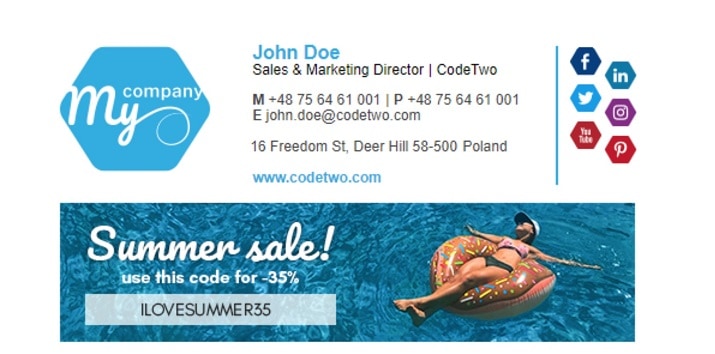
1. Use promotional codes to drive clicks
Turn your email signature into a source of traffic and conversions for your website by adding discount codes or sales and giveaway announcements to it.
This can motivate viewers to click through and find out more or even buy sometime after getting to the end of your message and seeing your signature.
You can also throw in other marketing elements like links to your social media profiles so they can keep in touch with you.
Don’t forget to make the copy and call-to-action accompanying your promotional offer very interesting, otherwise, people won’t be incentivized to click.
2. Create a layout of your brand logo and personal photo
Rather than simply sharing your image and contact info in your email signature, you can also add your company logo and other relevant details to boost brand awareness, reach, and recognition.
When doing so, choose a layout that allows both pieces of information to shine individually and together. The structure of your signature should make it easy for people to catch all the important information at a glance as seen in the example here.
3. Include an image of yourself
Adding a headshot to your email signature can help humanize your messages and remind recipients that they’re talking to or heading from a real person.
It can help people visualize what you look like, make them pay more attention, create a personal connection between you and them, and even increase the levels of trust and professionalism in your interactions.
When selecting an image for your signature, go with a simple portrait with a clear background that features you looking straight ahead like Abigail did in this example here.
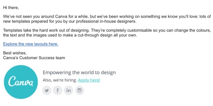
Gain new followers and boost engagement on your socials by including clickable icons to your key social media pages in your signature. It will give your email recipients more opportunities to connect with you and get to know you on a more personal basis.
Also, they will be able to reach out to you via channels that may be more convenient for them. Sharing links to your socials might even push new contacts to see you as trustworthy and personable.
5. Incorporate your contact information
The main ingredients for creating a good email signature are your contact details. You want to make it easy for people to learn more about you in a glance and also figure out the ways to contact you if needed.
Follow the steps of this example and start by including your first name and surname, then follow it up with your job title. If you want, you can include the name of the company you work for or the business you own.
Next comes a telephone number you can be reached on, your email address in case the recipient is using an email client that shows display names rather than an address, and your website URL so they can easily click-through to discover more about what you do.
Did you recently win an award in your industry? Did you just launch a new product line? Are you hiring for a couple of open positions? Or maybe you just closed a huge investment round?
Whatever your news is, you can use your email signature to share it with people. This will keep them updated on the interesting things you’re doing or that are happening in your organization.
Don’t forget to include a link to a landing page where recipients can find more details about your exciting announcement.
7. Consider a sign-off that aligns with your brand
It’s become common practice for people to close their emails with short phrases like “Warm regards” or “Yours truly.”
Sometimes, these statements can sound like a banal or stale remark, but you can avoid this by opting for a sign-off that’s unique and in alignment with your business or personal brand.
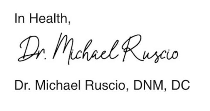
In this email signature example, Dr. Ruscio signs off his emails with “In Health.” This is charming and makes a lot of sense when you consider the line of work he’s in.
So take a cue from him and come up with something interesting and on-brand to end your emails with and include in your signature.
8. Add your certifications and awards
Whether you’re sending emails to prospects, leads, or loyal customers, they all want to feel like your brand actually knows what it’s doing.
Their confidence in you will increase if you can show that you’ve received recognition from customers, peers, and institutions as a top-tier professional, brand, or business.
So don’t hesitate to show off your accolades be it awards, certifications, accreditations, or associations that you belong to in your email signature. They will only help to build trust and authority for you and your business.
9. Work in a compelling call-to-action
Your email signature is another chance to get readers to take a desired action after reading your messages. It can help drive traffic to your site or social pages and even generate conversions for your brand.
Don’t just repeat the same call-to-action you used in the body of your email. Think of other useful, brand-impacting actions that people can take and write non-salesy CTAs that encourage them to take that step.
10. Choose an appropriate color palette
As is evident in this email signature example, the right color scheme can further strengthen your brand image. The colors you use in your email signature can determine whether it gets noticed or ignored.
You don’t want to combine too many colors or your signature will end up looking garish and overwhelming. Aim for the sweet spot of one or two complementary colors. Ideally, the colors you choose should align with your branding and industry.
If you’re a creative professional, you can get away with using bold, bright colors, while subtle palettes might be better suited to more formal industries.
11. Breakdown the content into sections
Ensuring your email messages are formatted in a way that makes them easy to read is an established rule in email marketing. This simple action can dramatically boost the chances of your recipients reading your entire email and even taking the actions you suggest.
The same holds true for email signatures. You want to make it easily readable and one way to achieve that is by dividing the different types of information into separate groups.
In this example, the signature owner houses their profile photo and contact information on the left, with their social media icons and company info on the right, with a clear demarcation between them.
12. Use visual hierarchy to give your signature a logical order
Visual hierarchy is a technique that marketers and designers use to create a specific flow of information and emphasize important data or details in their messages. You can apply this practice to design beautiful, readable email signatures.
Play with scaling, font size, color variations, and other elements to guide your reader’s attention to critical information, so they don’t miss out on the relevant details.
For instance, in this sample signature, the sender’s name is placed at the top and highlighted with a bigger font and different color.
The website address and call-to-action are also written in bold font so that they stand out from the rest of the signature.
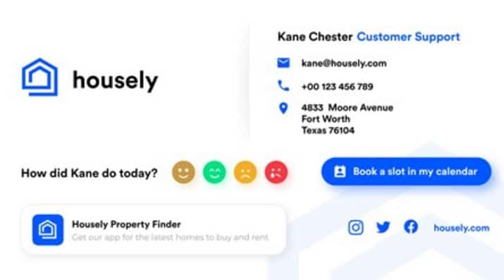
13. Include a link to your calendar
Few things are as frustrating as trying to schedule a meeting and figuring out the best time and date that work for the parties involved. Adding a calendar link to your email signature takes away this stress and makes it easier for anyone to book an appointment with you.
Recipients can simply tap on the link and pick a time that suits their schedule and avoid the frustrating back and forth that might even lead to you or them losing interest in the conversation completely.
14. Cultivate trust with client testimonials
Peer reviews are the lifeblood of marketing. They’re more effective than ads and all the promises you can make about your business, and you don’t have to spend a lot on them.
Incorporating reviews and testimonials from customers and clients into your signature is a great way of promoting your brand and building trust in your products or services. You can feature a short quote from a customer and follow it up with a call-to-action button or link that takes readers directly to your testimonials page.
15. Boost your latest blog posts
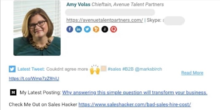
This email signature example shows how you can get your content in front of the right audience, drive traffic to your blog, and maximize engagement without going to too much trouble.
All you have to do is entice people with a compelling headline for your most recent blog post and they’ll want to click through to read the complete article.
Sharing links to your publications in your signature will push recipients to see you as a thought leader with lots of useful information and value to offer, which will, in turn, cultivate their trust in you.
16. Showcase your portfolio
Whether you’re a writer, photographer, UX designer, interior designer, construction company, or marketing agency, your email signature can be a chance to show off your portfolio.
In the example above, the email signature owner, a photographer, displays samples of some of the images they’ve taken. Adding your portfolio can help build confidence in your services and help you drum up new clients or customers.
You can even make the content in your portfolio clickable so viewers can click through to your website or other important pages to learn more about what you do.
17. Let animated visuals bring your signature to life
Photos and gifs can be far more convincing, engaging, and inspiring than written words. This is why their presence in your email signature can take it from unremarkable to attention-grabbing.
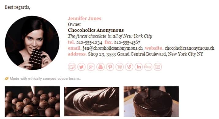
In the signature example here, Jennifer Jones makes it known that she is the owner of a confectionery store specializing in chocolatey creations.
She features all the usual trappings of show email signature such as phone number, fax number, website URL, and shop address, then deals the deal with animated gifs showing some of her products.
The visual is so yummy that anyone who comes across the signature will be tempted to visit her website or physical store to treat themselves to something delicious.
18. Promote your YouTube channel content
Video is one of the most engaging forms of content out there. It’s a fantastic channel for sharing your work with the world and your email signature can be a good place to promote your videos and get more eyes on them.
Whether you’re a performer, artist, videographer, producer, or content creator with a YouTube channel, you can embed a link to one of your videos in your email signature.
When people go through your emails and see the video at the end, it might pique their interest and push them to subscribe.
19. Reinforce your expertise
Your signature doesn’t have to be about your personal details and contact information alone. It can go beyond that to position you as an expert in your field or as someone who cares about your recipients and shares relevant information that can positively impact their lives.
In this example email signature, the user displays a personal photo and other important contact info. But instead of leaving the left-over whitespace empty, they leverage it to share useful self-care tips.
20. Add a personal touch with a handwritten sign-off
Take a cue from this email signature example and add a handwritten signature to your email signature. It adds a sense of uniqueness and authenticity to your signatures that text-based ones just can’t pull off.
Recipients of your emails will appreciate the personal touch and it can make you seem more relatable in their eyes.
Emails have a tendency to feel mechanical at times, but a handwritten signature can remind viewers that there’s an actual person on the other end speaking to them.
21. Showcase new and upcoming products
If you’ve got a new product out or coming soon, you can get more people to know about it and be on the lookout for it by featuring it in your email signature.
You can even follow it up with a CTA asking people to pre-order, try the demo, be the first to get notified when it drops, or offer them introductory discounts.
Be sure to add a good visual of the product, accompanied by a description, and a link to the product page, all of which are included in the above example.
22. Feature multiple CTAs to maximize the chances of conversion
Chances are your recipients or subscribers are made up of people with different interests, needs, and pain points. You can target multiple audiences at a time by including more than one call to action in your email signature.
This way, recipients can click on the action that applies to them instead of taking no action at all because your CTA is not targeting them. In this sample email signature, the realtor invites recipients to either download her app or find out the value of their home.
When using multiple CTAs, limit the options to two or three at a time to avoid creating confusion and make sure they don’t result in your signature looking cluttered.
23. Keep things interesting with an animated logo
Including branded materials like your company’s name and logo is a great way to spice up your email signature. It makes your signature look more professional and elevates your personal profile, while also creating a strong impression of your organization.
Animations can help your branding elements come alive and introduce an extra layer of attractiveness to your signature, making it more noticeable.
24. Leverage whitespace for a clean and minimal design
Going by this example, your email signature doesn’t have to be flamboyant to leave a good impression in the viewer’s mind. You can simply make do with one that shows relevant information like your name, occupation, phone number, website URL, and business address.
Remember to stick to one simple and clear font like Garamond, Didot, Georgia, Lucida Bright, and other web-safe ones. For a minimalistic design, you might also want to opt for less-bright colors that create a sense of comfort and are calming on the eyes.
25. Emphasize what your business offers
If you run a company, your email signature can be an opportunity for you to show people what your business does and they can benefit from it without outrightly pitching or selling to them.
Think of a value proposition or slogan that best embodies the “what” and “why” of your company, then pair it with a headshot, logo, your sender and business information, and a clickable banner with a strong call-to-action. What you’ve got is an email signature that tells a story and commands attention.
26. Include a sign-off in your signature
Every time you send an email, you probably sign it off with one phrase or another such as “Sincerely,” “Warmest regards,” “All my love,” etc.
Adding this closing remark to your email signature like in the example above can save you some time and keep you from forgetting to include a greeting at the end of your email.
This way, you won’t have to worry about typing a sign-off each time you want to send an email. And best of all, your closing statement can still look like it belongs in the body of your email even though it’s really fused with your signature.
27. Insert your Google Maps location
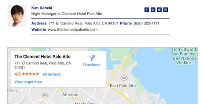
People can be skeptical about buying from a brand that they haven’t patronized before. They don’t want to be scammed, so including a Google Maps link that shows your business’s physical address can help allay their concerns.
And if you’re running a brick-and-mortar shop or other business ventures that require physical walk-ins like a restaurant or cafe, having a link to your location in your email signature can make it easier for your subscribers to click through and save your address.
This way they can quickly find your location when they’re on the go rather than having to Google it first.
28. Keep it simple but with a twist
This is a simple, yet classy way to design your email signature. It’s not splashy but it still manages to be eye-catching.
In this example, the sender’s name takes the lead in bold dark letters, followed by their job title, company name, and relevant content details.
However, instead of placing the company’s logo on the left as is usually the case, the signature owner switches it up and positions the logo on the right instead.
Since most people read from left to right, this little trick can increase your signature’s readability and ensure that your name is the center of attention.
Instead of an elaborate email signature, you can combine a basic signature with a banner to make the whole thing stand out even more.
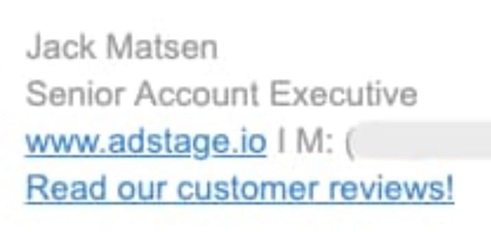
In this sample signature, the name, job role, contact information, and business address of the email sender are written and laid out with a simple design.
Just below it, you see a banner image containing the company’s name and logo, with a concise copy that invites you to learn more about the focus and offerings of the business, and a hard-to-miss CTA button in a contrasting color from everything else on the banner.
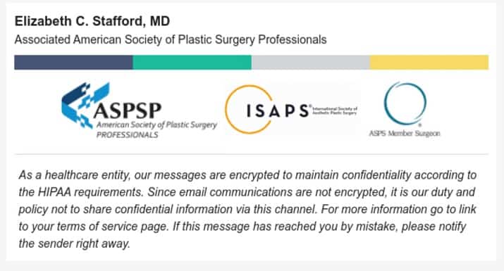
30. Add legal notices and compliance clauses
If you need to promote your company’s social or eco-friendly initiatives or show that you meet specific industry standards, you can draw inspiration from this email signature example.
Feel free to include your accreditations, disclaimers, confidentiality clauses, legal notices, and other compliance credentials as needed in your signature, but be mindful not to overcrowd it with unnecessary information.
Conclusion
Your email signature is prime real estate and you shouldn’t let it go to waste. It can provide a lot more value to you and your brand beyond just providing your contact information and leave a lasting impression on your email recipients.
Let these examples inspire you to craft a solid email signature or take another look at your current one and optimize it.
Be sure to check that your new email signature renders properly when viewed across desktop, mobile, tablets, and all the major browsers.
Cassie Riley has a passion for all things marketing and social media. She is a wife, mother, and entrepreneur. In her spare time, she enjoys traveling, language, music, writing, and unicorns. Cassie is a lifetime learner, and loves to spend time attending classes, webinars, and summits.
