When Opera Software shut down My Opera, its virtual community website for Opera users, its co-founder, Jon Stephenson von Tetzchner, launched another one. The new community was named Vivaldi, and it has evolved into a browser.
Since Vivaldi Technologies launched the browser in April 2016, it has quickly become a credible alternative to Google Chrome. It is fast, easy to use, and as one might expect from software developed by an Opera alum, it packs many features.
Thinking about making the switch from Chrome or another browser? In this article, we discuss how Vivaldi holds up in various categories, such as —
- Features
- User experience
- Security and Privacy
- Performance
- And more
Ready? Let’s review the Vivaldi Browser!
Getting Started: Installation And Setup
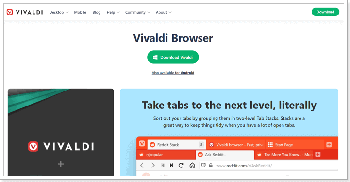
There isn’t much difference between getting started with Vivaldi and any other major browser. The browser is available on Windows, macOS, and Linux. All you have to do is visit the website to download the installation software.
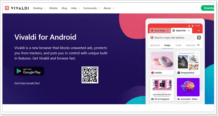
There is also a mobile version for Android devices. iOS users have to wait as of now.
The website automatically detects your operating system, so you don’t have to worry about downloading the wrong version, which is pretty neat. For this review, I tested the Windows version, specifically version 4.1, released in July 2021. It was a 75MB file that downloads and installs in seconds.
After installation, Vivaldi takes up some significant space on the hard drive (266MB), more than Firefox’s ultra-low 91MB for a full-featured browser. Regardless, it is much lower than Google Chrome’s 406MB.
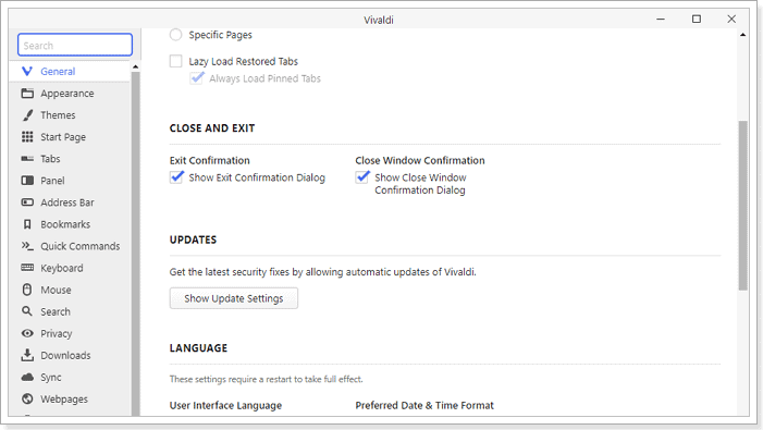
The default installation language is English, but you can choose from 50+ languages in the Advanced settings.
Customization, as you will see later in the review, is the defining philosophy for Vivaldi. That is immediately apparent when you run the browser for the first time. A short wizard will take you a series of customization settings to set up the browser.
You have the option of going for a busy or lean look or something in the middle of the road. This is a nice feature because it allows users to determine the kind of experience they prefer. Casual users don’t have to get overwhelmed by the sheer number of settings available to them.
They can simply choose the leanest version and start browsing.
After selecting your preferred experience, the wizard walks you through other parts of the setup, including importing your browsing data from other browsers on your computer.
Overall, it takes less than ten minutes to download, install, and set up the Vivaldi Browser for regular use.
Features
Unsurprisingly, Vivaldi has all the standard features of a modern browser. It has page zoom, search engine customization, feed reader, and Google’s autofill feature, which lets you fill in your information automatically.
It is also possible to choose your default search engine. The out-of-the-box options include Google, Bing, Ecosia, and DuckDuckGo, among others. There is also a reader view with a minute counter that shows the length of the content.
Also, because Vivaldi is built on Chromium, it is compatible with most Google Chrome extensions. When I added the uBlock and Grammarly extensions, they worked just fine. However, it is not compatible with extensions that change the interface. Vivaldi, however, has robust appearance settings that I also discuss later.
Beyond the standard features, Vivaldi has many more that make it worthy of consideration.
Tab Management
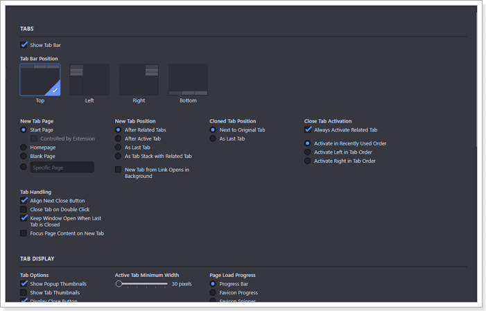
One of the features Vivaldi proudly touts is its tab management offering. Consistent with the central philosophy that everything should be customizable, there are many options for determining how your tabs appear and how they work. Plenty enough to be an article on their own.
You can choose where tabs appear, what happens when you open one, set page reload intervals, and search tabs, among other options. Also, when you hover the mouse over a tab, it shows the site thumbnail, similar to Edge or Chrome.
More notably, there are three ways to organize multiple tabs. They are the Accordion, Compact, and Two-Level styles, each with its own settings too.
As someone who opens a lot of tabs, Vivaldi makes it easier to know which tab is active. The active one takes the color of the site, while the rest remains off-white. And like everything else, this behavior is entirely customizable.
Split-Screen Mode
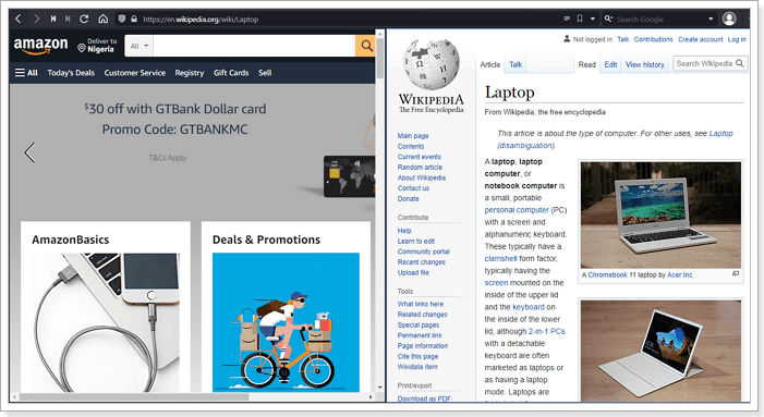
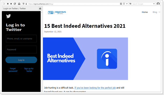
Vivaldi also has another cool and helpful feature, the Split-Screen view mode. With it, you can view more than one webpage on a screen. The feature comes in handy when you need to keep an eye on a page while working on another.
For instance, maybe you are waiting for tickets to a show to go live or keeping track of your Twitter or LinkedIn feed. You can split your screen and set the passive page to reload at a specified interval.
The Split-Screen mode is accessible under a feature named Page Tiling, and you can view up to four pages at once. The feature is easily accessible, and you can select different web pages for the view, regardless of their arrangement on the browser.
Vivaldi also has a web panel on the left-side toolbar where you can pin any website and visit on a split-screen. The screen real estate is narrow by default, so the browser opens the mobile version of the site when it is available. However, the size is completely adjustable.
Mail and Calendar Client
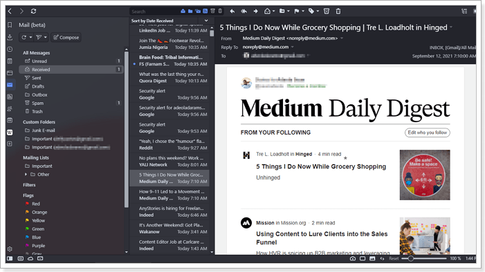
Vivaldi Browser also comes with an in-built Mail, Calendar, and Contacts client. The feature is still in beta, but it is very much accessible once you download the browser.
I did minimal testing on the Mail client, but it performed decently. You can add your existing email addresses, and your emails (sent, received, drafts, etc.) are imported automatically into the client. It is also possible to send emails or attach a file.
The same goes for the Calendar and Contact clients. Even though they are still in beta, they are functional enough to be a daily driver.
Other notable Vivaldi features include the Screen Capture tool that lets you take a snapshot of an entire webpage or selection. There is also a built-in Notes function for creating text notes against a specific website.
One other cool feature is Command Chains. The Vivaldi feature allows you to combine multiple browser commands (over 200) and execute them with one shortcut. Although it takes a minute to set up, it is a simple way to automate your workflow if you regularly go online for work.
User Interface
Vivaldi Browser advertises as the ideal browser for a power user in some corners. Much of that claim comes from the interface. However, that comes down to the user interface you choose. As mentioned earlier, there are three options – Essentials, Classic, and Fully Loaded.
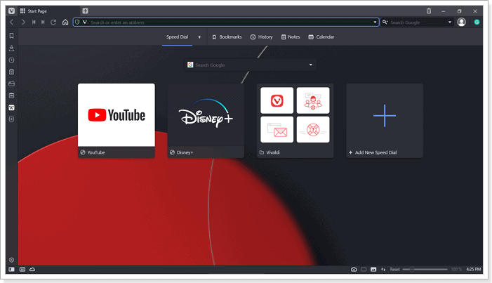
The Essentials and Classic options have a more streamlined interface and are very similar to other web browsers. The layout has the Address and Search bar at the top. The Refresh, Bookmark, and Home buttons are also in their usual positions. Of course, you can choose to change the placement of everything according to your preference.
Vivaldi’s Classic layout comes with Panels and Status bars. The Panel is a thin bar on the left side of the screen. It consists of traditional functions like Downloads, Bookmarks, History, and Vivaldi features like Notes, Mail, RSS feeds, and Web panels.
You can hide and access it easily from the Vivaldi logo at the top of the browser or by toggling a dedicated button in the Status bar. Besides that, this section also contains the Take a Break, Page Tiling, and Image/Animation behavior buttons.
In many ways, even in their streamlined form, Vivaldi Browser packs so many options in its interface, but 1) they are unobtrusive and 2) you can hide them.
Finally, you can customize the overall appearance by selecting your own theme, with plenty of options to choose from, and there is a dark mode.
Overall, the interface is familiar enough for anyone to get started with the browser easily but needs a bit of learning and time to take full advantage of its customization options.
Ease Of Use
Thanks to a default look similar to most browsers, Vivaldi is approachable for all types of users. The browser’s layout is familiar enough to even casual internet users with tabs, address bar, and navigation controls with recognizable icons.
Vivaldi builds another layer of ease into the browser on that foundation of familiarity with extensive customization options. Almost every functionality in Vivaldi is customizable either by look or behavior, allowing you to create a browser that genuinely feels like your own. It not only makes it easier to use a browser, but it also makes internet surfing a breeze.
After testing the browser, I put my theme to dark, added my Whatsapp and Telegram accounts to the web panel, and set up two email addresses. I also set a Command chain to open ten websites I always open on my laptop.
Now, when I open the browser and press the “T” key, Vivaldi automatically opens the websites, and I am ready to face the day. It makes me feel like Tony Stark walking into his garage.
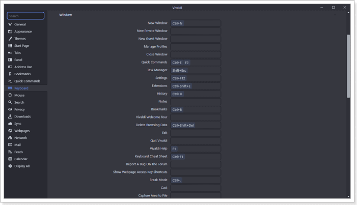
You can also set keyboard shortcuts for a host of actions you regularly perform on your browser, further streamlining your workflow.
Outside of those, features like page tiling mentioned earlier allow you to open view multiple websites simultaneously. It also has a Tab Cycler feature to scroll through opened tabs, and you can scroll in list or thumbnail form.
Finally, the layout has many functionalities that you can do a lot without using a shortcut or opening settings. You can keep up with social media without leaving your work tabs or using your phone.
Performance
Earlier versions of Vivaldi were noticeably slower than prominent competitors, and reviewers and users alike rightly complained. However, since the software company switched to Chromium, there has been a significant uptick in its speed and compatibility with different websites.
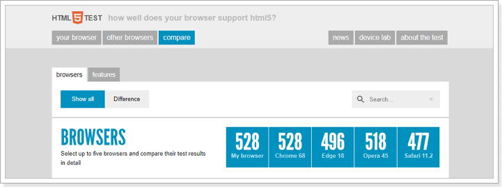
On HTML5Test.com, a website for testing the compatibility of browsers with the latest web standards, Vivaldi scored 528 out of a possible 555. It matched the newest version of Google Chrome and beat Edge, Opera, and Safari. On JavaScript benchmarks like JetStream2 and Google Octane, Vivaldi performed similarly to Opera and Chrome.
In WebXPRT 3, another industry-standard test for HTML5 and JavaScript compatibility, the browser scored 81. That’s four points better than Opera’s 76 and Google Chrome’s 73.
If you are not the type who lives and dies by benchmarks, visiting websites with different types of content was a breeze during my test, including media-heavy ones like 9GAG and Twitter.
The optimized pages loaded quickly, scrolling was smooth, and it didn’t have to reload after leaving a webpage for over an hour.
However, Vivaldi is not as excellent when it comes to RAM consumption. With 24 processes and 13 opened tabs, it consumed over 1400MB. It is a lot, but it is still roughly 10 percent less than Chrome. Also, you have the option to hibernate inactive tabs, which lowers the level of consumption.
Despite its high RAM consumption, Vivaldi consumes a moderate amount of battery. During those tests, its power usage remained low, sometimes drifting to Very Low.
In all, is Vivaldi the best performing browser out there? Especially RAM consumption? Not at all, but you get a lot out of it.
Security
When it comes to security, Vivaldi is not doing much better or worse than many modern browsers. Thanks to its Chromium foundation, the browser uses Google Safe Browsing to protect users from known malware and phishing websites.
It works, but it is not without its downsides. The browser has to send your browsing activity to Google. However, suppose you prefer to keep your divorce from Google total. In that case, Vivaldi offers the option to turn off the service, as long as you understand the risk.
Also, Vivaldi updates the app regularly, currently at an interval of once a week. A good thing considering Chromium’s popularity makes it vulnerable to attacks. Its frequency is even better than Chromium that only receives updates every two to three weeks. So, you are more likely to have a potential security risk fixed quickly by Vivaldi.
The browser also warns you when you try to access an unsecured website, specifically one over the HTTP connection. You don’t have to be a tech expert to notice the warning. Like Chrome, a Not Secure sign is next to the address bar.
Furthermore, Vivaldi has a Sync feature, which allows you to share your browsing data between the mobile and desktop apps. You can share the following between devices —
- History
- Autofill data
- Passwords
- Settings
- Bookmarks & Speed Dials
- Notes
Naturally, this exchange of data poses a risk, especially when it is in transit. However, Vivaldi has end-to-end encryption for its Sync service.
Ultimately, Vivaldi is not the most secure browser, largely thanks to its attachment to Google. Still, it does a decent job securing user data, particularly on services it has total control over.
Privacy
Vivaldi is one of a few newly launched browsers marketing themselves as privacy browsers. In that regard, it does some things well and surprisingly poorly in others.
The good – the browser only collects basic user information from your device. This information includes the version of the browser you are running, CPU architecture, screen resolution, and the randomized ID assigned to your browser after installation.
The bad – Vivaldi collects the information every 24 hours. It also collects your IP address, albeit without the last octet (last three digits). According to the company, the browser does this to “determine the total number of active users and their geographical distribution.”
It is an unusual policy by a supposedly privacy-oriented browser, but not the worst Vivaldi flaw in this category. That lies in its default settings and lack of enough privacy features.
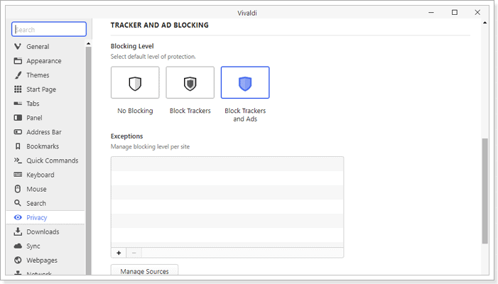
Vivaldi has a good ad/tracker blocker that not keeps you protected from tracking cookies from websites that want to show you ads. It also has the side effect of making pages load faster. But that is about it when it comes to privacy features by the browser.
That is a lot less than Brave, with its fingerprint randomization and upgrading of HTTP connections to HTTPS features.
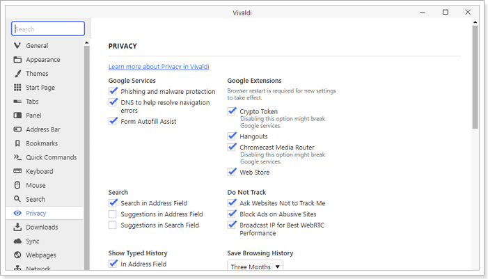
Besides that, Vivaldi also enables WebRTC by default, a service that broadcasts your IP address. Even though the service is necessary per the Chromium foundation, it should not default for a privacy-oriented browser. Additionally, the browser accepts all cookies by default.
While to be fair, excellent browsers like Firefox also lack default privacy settings. But the difference is Firefox offers more privacy-focused features than an ad/tracker blocker.
On the other hand, Vivaldi has a more straightforward and easier-to-understand privacy policy document than Google Chrome or Opera.
Vivaldi Mobile Browser
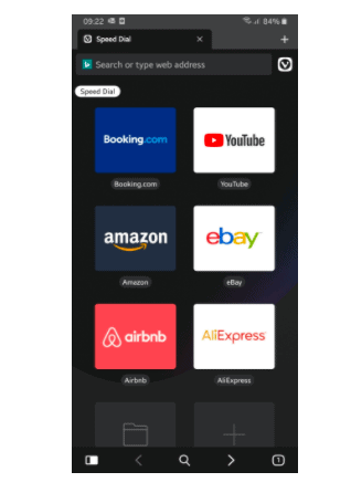
So far, we have been reviewing the desktop version of Vivaldi Browser. There is also a mobile version of the rising browser. It is only available on Android, but it has gotten over one million downloads with a 4.2 user rating.
The mobile browser is not a direct copy of the desktop version. There are some notable differences, but it is a more than decent replication, particularly in the crucial categories.
Features
One of the things I like about the mobile version is the availability of tab grouping, or as Vivaldi officially calls it, Tab Stacks. You can also swipe quickly to find open tabs, like Tab Cycler in the desktop version.
You also get the signature Vivaldi ad and tracker blocker, with the option to set your preferred protection level. You can select between no blocking, blocking trackers, blocking trackers, and ads from Settings. It is also possible to change the settings for an individual website.
The blocker uses DuckDuckGo Tracker Radar, known for a rich blocklist that enhances internet privacy.
The mobile version also comes with multiple search engines. However, unlike its desktop version, you are limited to seven options – Ecosia, DuckDuckGo, Google, Bing, Startpage, Wikipedia, and Qwant. Granted, that’s enough for most people, but an option to add your own would have been nice.
Other notable features include the screenshot capture tool. You can capture the whole page or the visible area—no option for manual selections. You will have to crop it out with another app.
There is also Reader mode, private tabs with DuckDuckGo as the default search engine, and end-to-end encryption synchronization with the desktop version.
Overall, these features are laid out in an easy on the eye UI that focuses on the content and is equally customizable.
Ease of Use
Vivaldi Browser’s UI makes it attractive to look at and easy to use. It is completely customizable, including hiding the status bar permanently or when it is in landscape mode.
It also has a tab switcher that uses a thumbnail design to help you find a specific page, complete with a drag and drop feature to organize active sites.
Furthermore, with the Notes and Sync feature, you can attach a note and access it on your PC later or vice versa when you research using your mobile device.
One quality that I found particularly neat and smart is the search engine icons above the address bar. Even though you can set a default search engine, you can choose your preferred search engine when you tap the address bar for that particular query.
Verdict – How Good Is The Vivaldi Browser?
There is a lot to discover about Vivaldi, and the more you use it, the more you fall in love with it. It packs so many features, mostly integrated within a single window.
I especially enjoy that I don’t have to open multiple tabs or grab my phone to keep up with work and social media.
That said, it could do with a few more privacy features, like an in-built VPN, and its mobile synchronization is currently limited to Android devices.
Still, it is a slick browser that is fast and easy to use, with plenty to enjoy. The only reason I wouldn’t recommend it is if you are a casual user. You will be overwhelmed by too many features because it would be a shame if you only used the basic mode.
Cassie Riley has a passion for all things marketing and social media. She is a wife, mother, and entrepreneur. In her spare time, she enjoys traveling, language, music, writing, and unicorns. Cassie is a lifetime learner, and loves to spend time attending classes, webinars, and summits.
