What do you do when you have lots of data but can’t quite get the overall picture by reading through the report? You could take time to pick out the important details and add them to a separate sheet for further analysis, but that’s a tedious, time-consuming job.
Thankfully, you can use data visualization software to create imagery or graphics that will help you make sense out of all the data you have.
Charts, maps, and graphs allow you to view trends, uncover outliers, and recognize relationships in your data. Ultimately, you’ll make more informed decisions, which can increase your efficiency, income, and profit.
The challenge is that there are many data visualization tools on the market, which makes it difficult to figure out the best one for your needs.
These tools come with multiple features and capabilities that bring together data from across your business to give the full picture of the whole story and give actionable insights to users of all skill levels.
Kibana is one of the popular data visualization tools that help you produce a graphical data visualization that’s interactive and allows you to create charts to use in reporting dashboards.
However, not all its features are available open-source, meaning you’ll have to pay for some of them. Plus, the query language can be tricky to set up, making the tool harder to use.
Non-technical people can learn Kibana, but it still feels complicated enough for only engineers or data analysts to use.
Installation of external plugins needs much effort, so it’s difficult to install Kibana on the first go. And the user interface could use some improvement, it can be a little complex to view logs, and sometimes, old data logs are difficult to find out, the time range isn’t precisely caught to have an error.
Fortunately, there are several other data visualization tools. That’s why we’ve compiled a list of the 15 best Kibana alternatives you can use in your business.
Also Read: Best Kibana Dashboard Examples
Best Kibana Alternatives
1. Grafana
This open-source data visualization tool works like Kibana, except you can use it on top of different data – especially with Elasticsearch, Graphite, and InfluxDB.
Grafana gives more metrics support compared to Kibana and has a more feature that helps you swap Graphite-web so you can create easy dashboards.
The visualizations in Grafana, also known as panels, are useful in showing different data visualization types, making them more beautiful.
You can use Grafana for single sat, graph, table, free text panel, and heat map types. Plus, you get customization options that help you split up your data however you want, and you get to play with labels, colors choice, and the size of panels among other options.
Its design caters to users who want to analyze and visualize metrics like memory, disk, system CPU, and I/O utilization. You won’t get full-text data querying though.
And Grafana is configured through .ini files, which are easier to work with compared to the syntax-sensitive YAML configuration files in Kibana. You can also use environment variables to override configuration options.
While Kibana only works with Elasticsearch, Grafana’s query editor is customized for capabilities and features in the data source.
Explore: Best Grafana Alternatives
2. Graylog
Graylog is another suitable alternative to Kibana for data visualization. The open-source tool works as a log management platform where the data from your organization is stored within a centralized system.
The software can move large amounts of data in terabytes, process it, and store it for further processing later based on your requirements.
Unlike Kibana, which is an ELK stack element that handles the graphical user interface to visualize large data sets, Graylog depends on Elasticsearch and MongoDB to operate.
Plus, there are different genres in which the two solutions differentiate themselves, including the learning curve, for which Graylog is easier than Kibana, availability of plugins, usability, indexing, pricing, and visualizations.
Kibana is part of an advanced suite of tools, meaning its usability isn’t as easy as that of Graylog, which has a simple graphical user interface, and you can find all the options in there.
Graylog has fewer plugins than Kibana, but in terms of pricing, Graylog is open-source with a fixed cost per server, while Kibana may be open-source, but it gets pricier because you’d be compelled to buy plugins.
Also Read: Bad Data Visualization Examples
3. Splunk
Splunk is a data visualization software that’s well maintained and established on the market compared to Kibana – which is a relatively new and upcoming tool.
Splunk helps you analyze logs and machine-generated data, security, application monitoring, and web apps while representing data in its native graphs, dashboards, and other elements.
You also get a well-established customer support team in Splunk that helps you with any issues you may face, unlike Kibana’s – which isn’t as proficient because it’s a fairly new tool.
Kibana also has a flexible visualization platform and interactive dashboard for a simple experience, but Splunk goes further to offer a SaaS interface that analyzes machine data efficiently.
The software belongs to the analysis and log management category, while Kibana is in the category of monitoring tools. Splunk is also a licensed software with three premium versions: enterprise, cloud, and lite.
The software is truly agile, while Kibana is part of the ELK stack, meaning you can develop your PoC and easily convert it to a product through instant conversions. Plus, you can create central repositories across the cloud in Splunk, and retrieve the data stored therein from various sources.
4. Databox
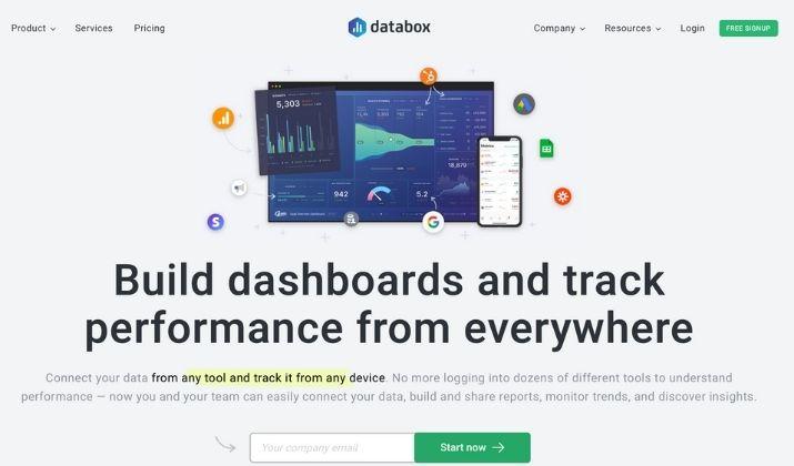
Databox works in the business analytics space. The software pulls and stores all your data in one place so you can track, monitor, and discover insights in real time.
To get more control over your data, you can mix and match data from different sources and enjoy better analytics performance.
Databox offers 70 popular integrations, so you can use it with other applications including Facebook, Salesforce, Google Analytics, Shopify, and others. When networks are busy or massive uploads aren’t workable, the Microsoft utility lets you send data to the Azure cloud for quick and easy access or retrieval.
The software is easier to administrate and set up compared to Kibana, which is thought to be complex and has a steeper learning curve. It’s also better at support and has lots of useful scenarios, especially where your capacity and connectivity are limited.
Its dashboard offers a merged view of the company KPIs, and you can customize it and add metrics you’d like analyzed while drilling down to specific attributes to get specific information on performance based on each attribute.
5. Looker
Looker is an extensive business intelligence and data visualization tool used to analyze data in real-time for proper decisions. You get full user control to choose various visualization tools and create a custom panel so it’s easier to control the decisions you make.
You can visualize your data as charts or web charts, heat maps, chord diagrams, word clouds, and more.
The software is built for companies that already have a data analytics team and can use their LookML to define their data and then combine, drill down, and analyze it in dashboards and reports in real-time.
Plus, it connects to your databases to update your data and you can use natural language that matches your business LookML custom settings to develop your own reports.
Its intuitive workflow and interface make it easier to navigate and you can clean up, manage, and interpret the data with no complicated coding, like that of Kibana.
Looker’s self-service features make the data analytics process simpler for any kind of user. And you can collaborate with others through Looker’s strong mobile device and browser support. You can also generate and share via email or through cloud storage or spreadsheets.
6. TIBCO Spotfire
TIBCO Spotfire is a data visualization tool that’s optimized for quick response. The software offers collaborative, event-driven, and predictive data analysis, self-service data discovery, and quick actionable insights.
The tool aims to democratize data across your business by allowing your team to access the information rather than forcing your IT or data teams to make requests for each employee.
It offers platform, cloud, enterprise, and AWS-focused systems for business intelligence from lots of disparate data sources. And it has extensive capabilities that include Big Content and Big Data.
Big Content helps you analyze user-generated text across email, search terms, and chat platforms while identifying customer pain points and solutions for it.
You also get predictive analysis from your data so you don’t react to things but rather be proactive about it. It offers an interactive dashboard for data exploration, and unlike Kibana, which has a learning curve, Spotfire is easier to use, set up, and administer even though it’s more expensive.
The software has less room for customization, but it’s good to use when you want to build and compare models using graphs.
7. Tableau
Tableau is a data visualization tool that helps you make sense of your data by making Big Data small, insightful, and actionable. In short, it helps you see and figure out your data.
The software offers a front-end facility that offers visibility into different types of data that would otherwise be data points that are separate and useless to you. Plus, it offers visual query language (VizQL), a more interactive way of visualizing data, and can create data visualization from unstructured and structured data.
You also get storyboarding and you can extract geospatial data through the Spatial File Connectors, which you won’t find with Kibana. The established tool makes beautiful visualizations but it’s more focused on corporates with bigger budgets and data engineers.
Tableau has a free or public version but has limited functionalities. And the more you play, the more features you can access with the software, including third-parties’ benchmarked data.
Securely access data source and analysis happens in Tableau in more detail for all your business information. You can also compare your organization’s performance with industry standards and your competitors, and predict possibilities in the future so you can make accurate decisions for your company’s growth.
Tableau differs from Kibana across how the tools work, pricing, alert processes, key features, and data sharing. Kibana is open-source and depends on ElasticSearch for its data while Tableau extracts data from any platform.
The alert processes also vary between Kibana and Tableau, with the former’s alerts happening when there are multiple log-in events, social media performance, and display of banking credentials.
Tableau has data-driven alerts that are sent out automatically to specific people while Kibana notifies people on Slack, email, PagerDuty, and HipChat.
Tableau is mobile-friendly, has dynamic parameters, Viz animations, buffer calculations, and data sharing procedures, while Kibana offers interactive charts, geospatial data mapping, reports, multiple search options, and detection of data irregularity.
Also Read: Best Tableau Alternatives
8. Highcharts
Highcharts is a software charting library that allows you to use web pages to create interactive JavaScript charts. It’s written in pure JavaScript and offers interactive yet intuitive charts to your web app or website.
The tool can be used for free but for personal usage, and commercial users have to opt for a license unlike using Kibana, which is open-source.
However, Highcharts is easier to set up and administer compared to Kibana and has better support, which Kibana users have raised concerns over.
Plus, you get features like charts with multiple options to create interactive charts, a non-commercial version that works with tablets and mobile phones, and screen reader support, which is helpful for people with visual disabilities.
9. Plotly
Plotly provides the ability to use a framework in Python to create interactive dashboards and web applications. It uses a modern user interface built on Flask and React to add elements like dropdowns and sliders to your data reporting dashboards.
When compared to Kibana, Plotly ranks higher for its user base including capabilities like 3D graphing and a more fully-featured library.
You can create interactive charts, and generate WebGL and D3.js supportive charts.
Plus, it’s easier to use than Kibana as you just import your data, compose and design the charts, then share them with others.
Some of its key features include the dashboard that’s easy to use and understand, easy and quick importation of data from a file, SQL, or URL and privacy settings that allow you to limit viewing or editing parts for the charts.
You can quickly create dashboards, use the stateless design to scale easily, build web apps with Python analytics, and use natural language processing and machine learning.
10. Klipfolio
Klipfolio interacts with your data directly so you can make instant decisions and know how your business performs. It compares monthly data, for example this and last month, or the same period in the previous year in one click.
With Klipfolio, you get more features than Kibana like drag-and-drop for data visualization and you can create a custom dashboard using a palette and other features.
The tool also has bullet charts and scatter plots, but you can also inject custom HTML into your dashboard. And it has an easier setup and better support compared to Kibana.
11. OpenSearch Dashboards
OpenSearch Dashboards is based on a fork of Kibana. The data visualization user interface provides improvements that you won’t find on Kibana such as additional security so you can operate in compliance with SOC 2, CMMC, and NIST leading data compliance regulations.
The software is an open-source solution that provides a public roadmap so you get to view features such as notebooks, Gantt charts, tenancy, and on-demand CSV reports beforehand.
The visualization tool also offers support for alerting on audit logs and drag-and-drop report creation.
12. Logit.io
Logit.io is another Kibana alternative that ensures you can create log or metrics data and has total visibility of their infrastructure.
The solution also offers auditing and compliance functions along with all the features you need to visualize data while creating intuitive reporting dashboards that you can use for non-technical and technical scenarios.
Logit.io can help you use Kibana and other tools mentioned in this list alongside each other within minutes of signing up. Some of these features include custom dashboards, unlimited users, autoscaling pen platform, alerting and notifications, highly available data centers, enterprise 99.99 percent uptime SLAs, and authentication options like SAML, SSO, GitHub, Google, Azure, and more.
Logit.io has a free 14-day trial, after which you can opt to pay monthly or annually for the premium package.
Also Read: Tableau vs Power BI
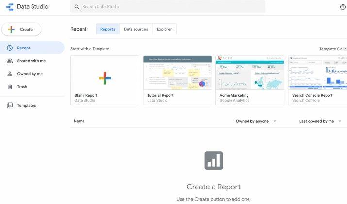
13. Google Data Studio
Like Kibana, Google Data Studio is free to use so you can convert data into dynamically updating, highly customizable dashboards. You can build out reports from data in Google platforms like Google Ads and Google Analytics.
The software offers better value as it turns your data into easy to read, share, customizable, and informative dashboards and reports. This way, you can start telling great, compelling stories with your data while making better decisions for your business.
The tool offers features like charts, date range, add pages, blend data, filter control, and edit versus view permissions.
It’s also easier to set up and doesn’t have a learning curve like Kibana, plus it’s more usable and easier to administer.
14. Microsoft Power BI
Power BI is an intuitive data visualization software that offers multiple smart data features through its efficient and intuitive visualization and tables.
You can use it to convert raw data into useful stats and insights for better business decision-making.
Compared to Kibana, Microsoft Power BI stands out owing to its higher levels of satisfaction measured for its ability to understand its users’ needs. The tool rates highly in terms of ease of use, where Kibana takes a backseat, deploy, and administer.
It’s specifically built for data visualization and analysis, but you also get the ability to embed data in your apps – which other tools don’t provide. You get a free trial with an upgrade to the business version and use it alongside PowerApps and other Microsoft Business Application systems.
Other features you get include trend indicators, online analytical processing, and navigation pane reporting.
Explore: Best Free Power BI Alternatives
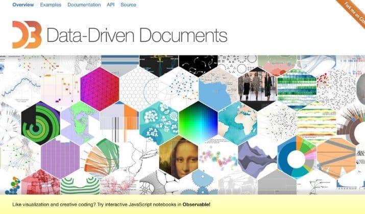
15. D3.js
D3.js is a Kibana alternative used by many data science practitioners as it produces complex yet impressive results more than Kibana and other tools.
The software helps you visualize your data in a fairly simple way and can integrate with tools like Power BI to deliver custom types of charts.
Other features it offers include a built-in element inspector for debugging. It uses canvas, HTML, and SVG, plus a data-driven approach for dom manipulation.
It’s also fairly affordable compared to other tools mentioned here, though not open-source like Kibana, but $7 per user per month isn’t too pricey even for beginners.
Wrapping Up
We’ve covered the reasons why Kibana isn’t the only data visualization tool you can use to accomplish your goals and make better business decisions.
Any of these 15 best Kibana alternatives can help you empower the data analysis process so you can get answers to complex questions.
Give each one a try and see which one works best to boost your data storytelling.
Tom loves to write on technology, e-commerce & internet marketing.
Tom has been a full-time internet marketer for two decades now, earning millions of dollars while living life on his own terms. Along the way, he’s also coached thousands of other people to success.


