Business intelligence dashboards are a great way to track the performance of your business overall. You can view many metrics and data points in one place, allowing you to quickly see where your business is holding and where it is going.
There are many software that allow you to create business intelligence dashboards. Today, I will be showing you 20 business intelligence dashboards that you can use as inspiration for your own dashboards.
Use these dashboards as a way to figure out how to set up your own dashboard or for ideas about which types of datasets to include in your dashboards.
What Are Dashboards?
Dashboards are boards with various datasets and metrics. Usually, each dataset will have its own tile, and the dashboard will be made up of many tiles.
The way data is presented might differ. For example, some data might be presented in a graph form, while others will come in absolute numbers (total sales, for example).
Dashboards are usually only one page long, though you might have to scroll down to view the entire dashboard if it has a lot of tiles. That is the advantage and purpose of dashboards – the ability to view all the data you want to track about your business or a specific marketing campaign in one place.
There are many software that allow you to build dashboards, such as Power Bi. In this article, I will show you dashboard examples from various software.
Interesting Post: Best Tableau Dashboard Examples
25 Business Intelligence Dashboard Examples
1. Website Traffic Dashboard (ClicData)
This website traffic dashboard example comes to us courtesy of ClicData. It shows you an overview of the traffic visiting your website.
For example, you can see the number of visitors on your website in a specific time frame, as well as the number of sessions overall (including multiple sessions made by one visitor). You can see maps and charts showing the geographical location of your visitors and how they are finding your website.
Other metrics you can view are bounce rates and page views per session.
2. Executive Marketing Dashboard (Datapine)
This executive marketing dashboard is a bit different than most marketing dashboards. While most marketing dashboards focus on hard marketing metrics, like click-through rates, open rates, and other metrics of importance to marketers, this dashboard is geared towards executives who don’t know about such metrics.
Instead, it puts a dollar amount on each metric, allowing executives to see how much profits they are getting from each marketing metric or channel.
For example, you can see data such as:
- Total revenue
- Revenue per customer or lead acquired
- Cost per acquisition (how much it costs to acquire each customer)
- Cost per acquisition broken down by marketing channels (search engine ads, TV ads, social media, etc.)
- Profit per acquisition (broken down by marketing channel as well)
Check Out: Best Grafana Dashboard Examples
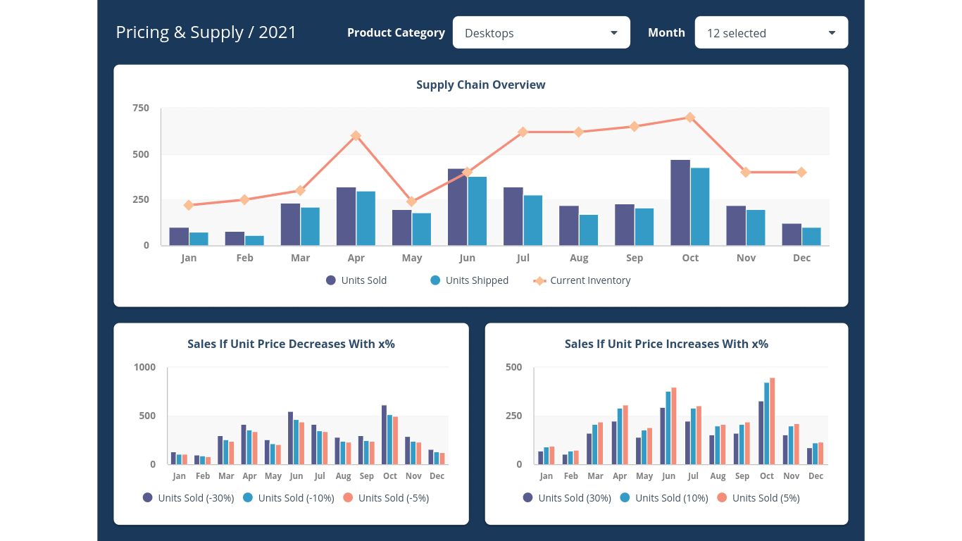
3. Pricing And Supply Dashboard (ClicData)
This dashboard is meant to give an overview of pricing and supply for various products you are selling. Choose which product type you want to see data for, and you will see metrics like:
- Units sold
- Units shipped
- Current inventory and how it compares to sold and shipped units
All of that data is shown by month, using bar and line graphs.
You can also calculate how units sold and units shipped will change if the price increases or decreases.
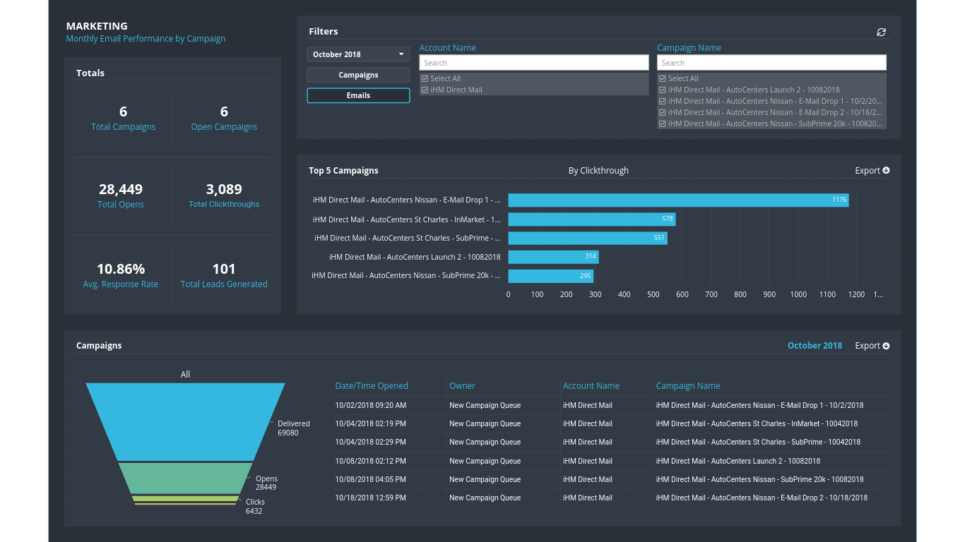
4. Email Marketing Campaign Performance Dashboard (ClicData)
This dashboard helps you understand the performance of your email marketing campaigns. You can see metrics like:
- Total email opens
- Total clicks
- Total leads generated
- Average response rate
- Top campaign breakdown by click rate
You can filter for specific campaigns or time ranges. It’s a more specific dashboard explicitly designed for email marketing teams.
Also Read: Best Qlikview Dashboard Examples
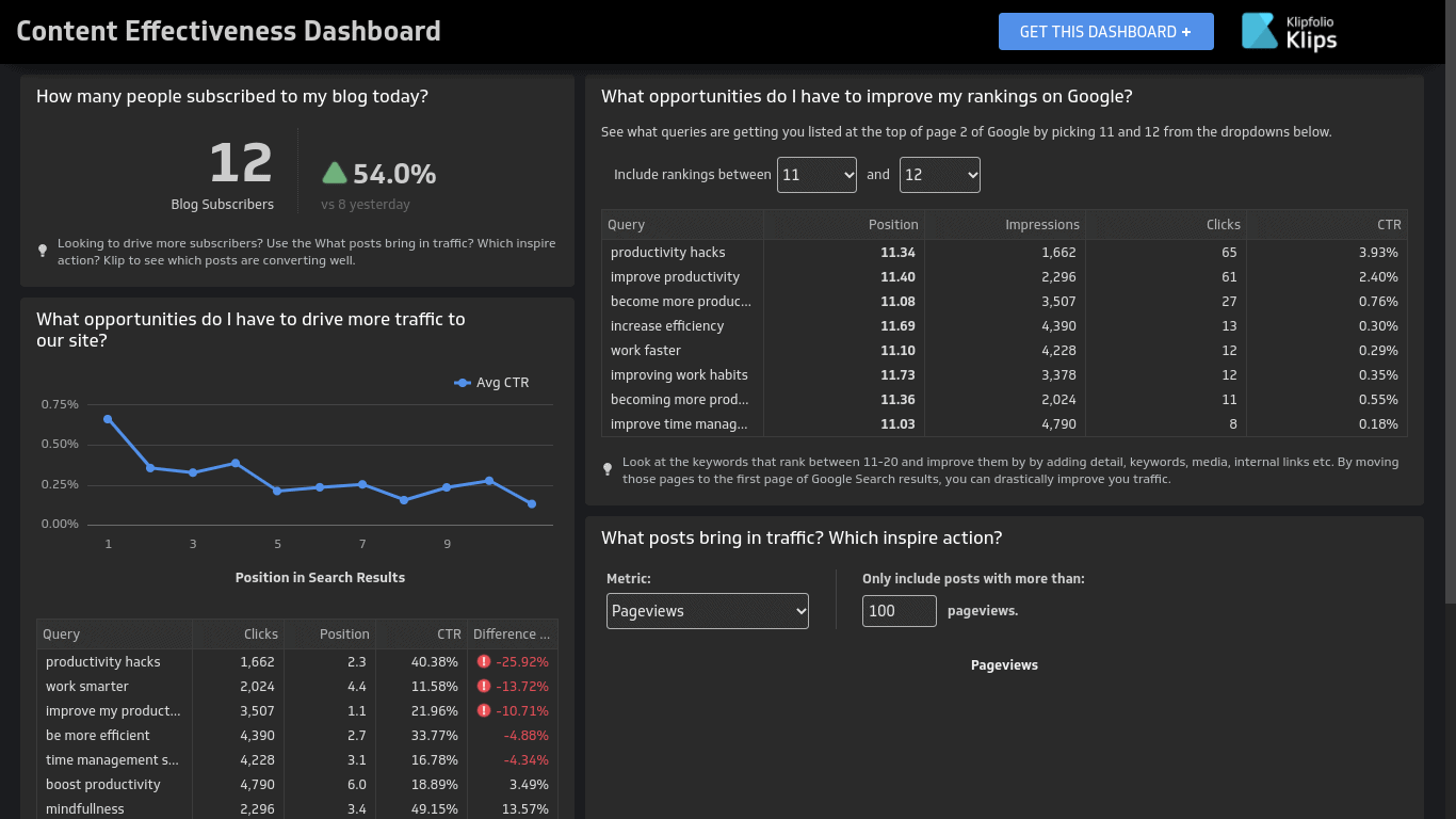
5. Content Effectiveness Dashboard (Klipfolio)
This dashboard will help you measure the effectiveness of your content marketing campaigns. It’s a great way to go beyond simple website analytics and figure out whether your content marketing strategy is working and how you might be able to improve your methods for better results.
Here are some of the things you can see using this particular dashboard:
- How many new people subscribed to your blog today, and by how much new subscribers increased percentage-wise
- Your position in the search engine results for various target keywords
- The click-through rate and total clicks you are getting for each of those keywords
- Average click-through rate graph based on ranking position (for example, average click-through rate for keywords for which you are ranking in the first position vs the second position)
- Top posts by pageview
- Top posts by conversion rate
- Keywords that have sub-par rankings (for example, you can search for keywords ranking in the 11-12 position on Google, which you may be able to push to the first page)
- Total impressions, clicks, and click-through rates for those keywords
Overall, it’s a great dashboard to help you understand how well your content is ranking and how many visitors you are getting for various target keywords and from any articles you wrote. It is also excellent for understanding opportunities to increase your rankings.
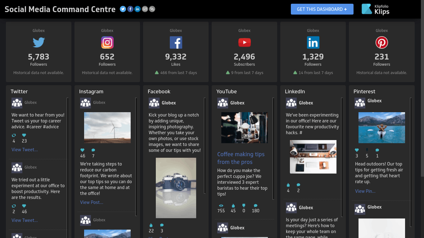
6. Social Media Command Center (Klipfolio)
The “Social Media Command Center” dashboard provides an overview of all your social media channels. It’s actually a very simple dashboard, but it allows you to see what your marketing team has been doing on various social media channels, what they have been posting, and what your growth looks like.
You can see:
- Total Twitter followers
- Instagram followers
- Facebook likes (including how many new likes you got over the past week)
- Total and new YouTube subscribers
- Total and new LinkedIn followers
- Pinterest followers
- New posts on each channel
Also Read: Best Smartsheet Dashboard Examples
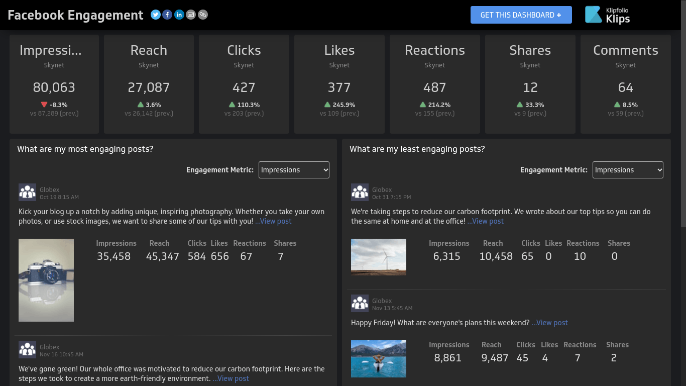
7. Facebook Engagement Dashboard (Klipfolio)
While the Social Media Command Center dashboard gives you an overview of all your social media channels, this dashboard drills down a bit and focuses on Facebook in particular. It goes in-depth to help you understand how well your Facebook marketing strategy is doing.
Here are some of the metrics you can see using this dashboard:
- Impressions
- Reach
- Clicks
- Likes
- Reactions
- Shares
- Comments
In addition to being able to see the total of each dataset for the period selected, you will see by how many likes, impressions, etc. have gone up or down compared to the previous period. This allows you to figure out where to direct your efforts – for example, you might start running ads with the purpose of getting likes.
In addition, you will be able to see your most engaging posts and least engaging posts, filtered by one of the above metrics (most/least impressions, clicks, likes, etc.). For each post, you will see how many impressions, clicks, likes, etc. it got.
This will allow you to figure out which posts are the most effective at garnering likes, shares, reactions, comments, etc. For example, some topics might be controversial and cause people to comment, but if you are not getting any likes, they may not be very popular.
If a post is getting a lot of shares, on the other hand, it might have some useful information that people want to share with friends and family.
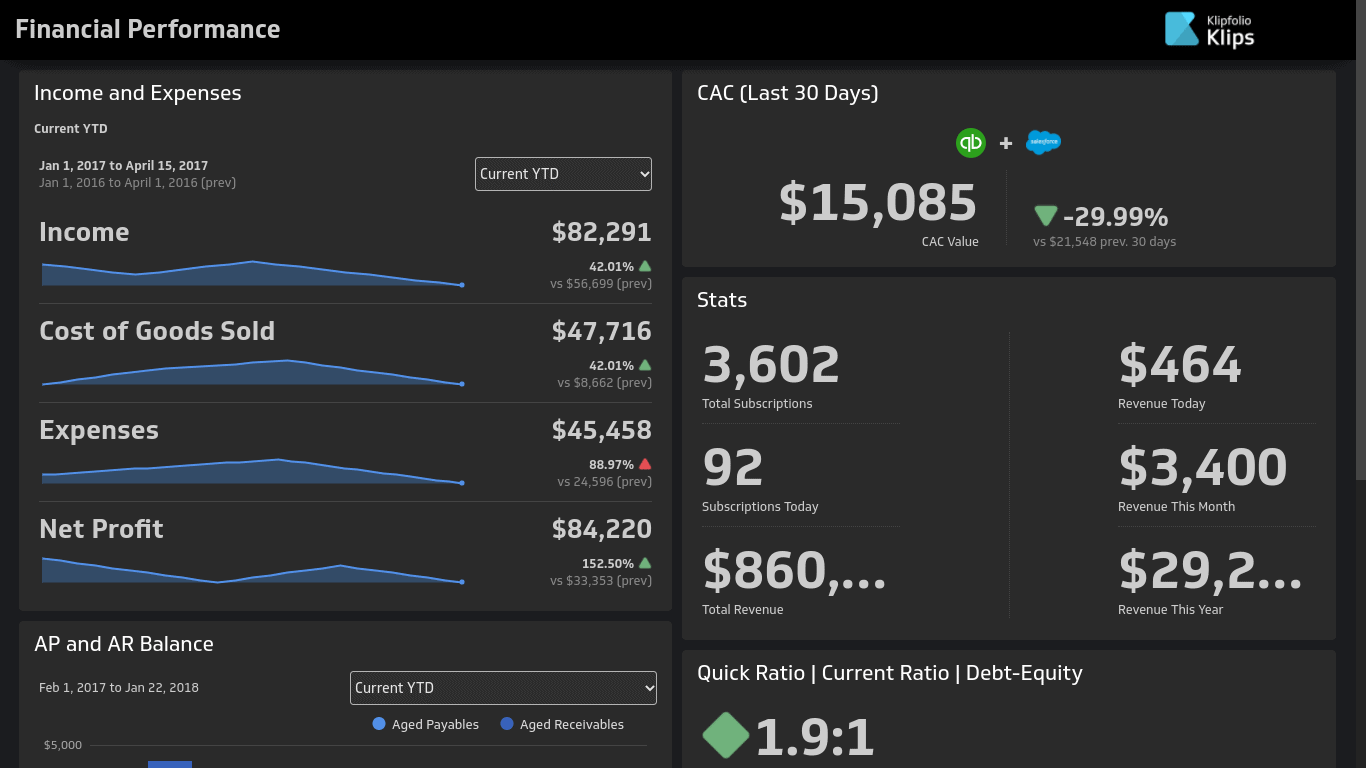
8. Financial Performance (Klipfolio)
If I’m including a lot of Klipfolio dashboard examples, it is because I think their dashboards are very useful. Not only are these dashboard examples laid out in an easy-to-understand, straightforward manner, but they include important information that can help you improve your business.
Using the financial performance dashboard, you can view essential metrics related to the financial performance aspect of your business. Some of the metrics you can track, using graphs, include:
- Total income
- Cost of goods sold
- Expenses
- Net profits
For each of those metrics, you will see the dataset for the previous time period and by how much it went up or down. For example, you can see your total income for the past YTD vs the total income for the prior YTD, along with the percentage-wise increase.
You will also see a line graph showing the ups and downs of the metric over the period – for example, you might see some spikes during the year for your total income or net profits.
You can see your total customer acquisition cost, as well as various customer acquisition statistics, such as:
- Total subscriptions
- New subscriptions today
- Total revenue
- Today’s revenue
- This week’s revenue
- This month’s revenue
There are other stats you can track with this dashboard as well.
Explore: Best Project Dashboard Examples
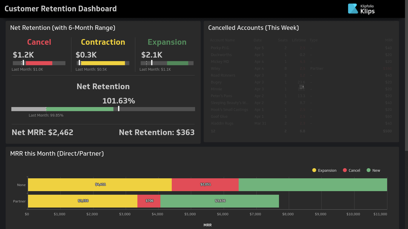
9. Customer Retention Dashboard (Klipfolio)
This dashboard helps you understand your customer retention metrics. Given that it is 5x more expensive to acquire new customers than to retain existing customers, it pays to look at your customer retention rates.
If your customer retention rates are low, you need to figure out why people are leaving and what you can do to make sure people stick around longer.
Here are some of the things you can track using this dashboard:
- Net retention
- Net monthly recurring revenue
- Cancellations
- Canceled accounts this week
You can also see a bar and line graph displaying new vs canceled accounts and net retention rates.
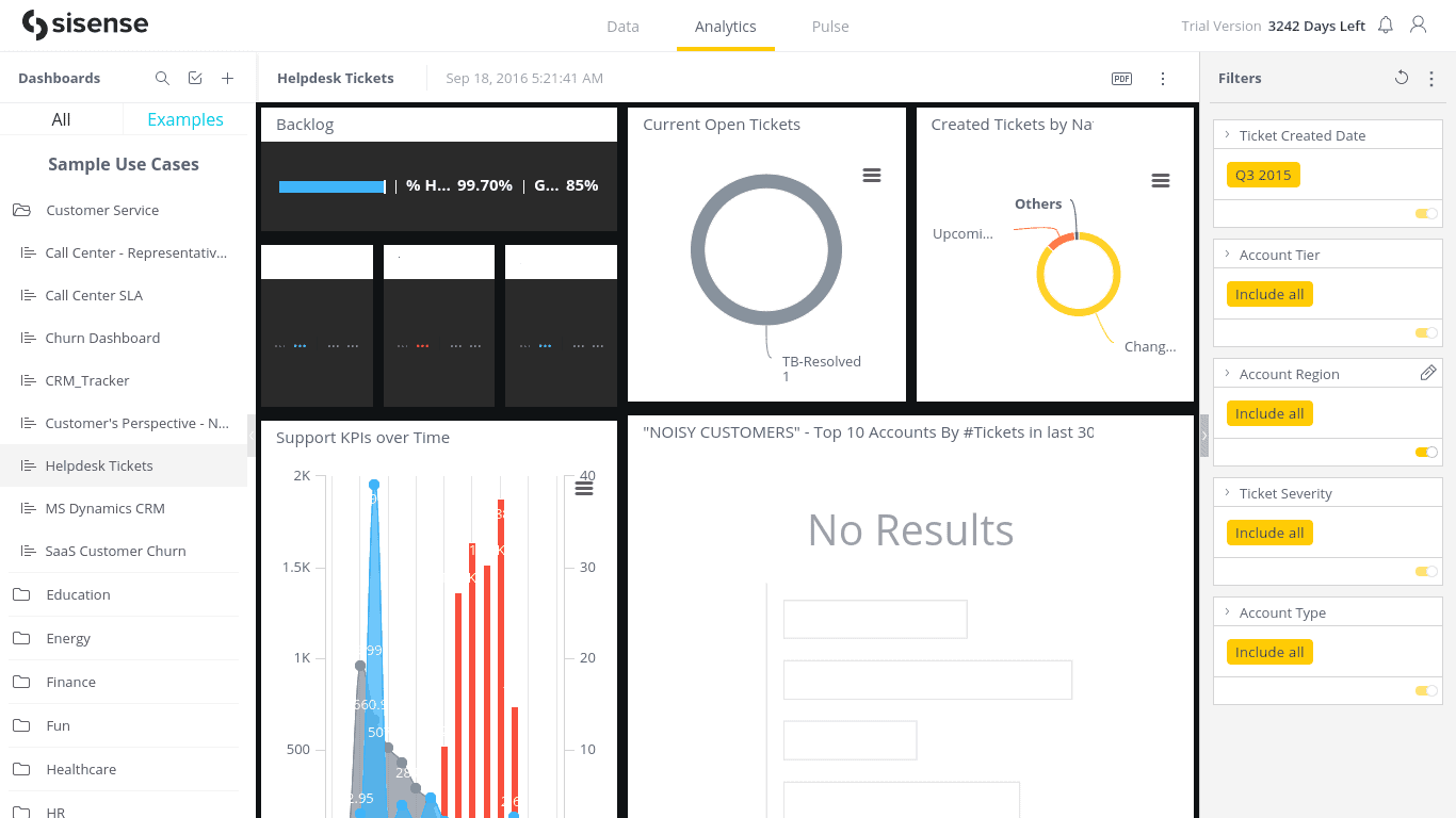
10. Helpdesk Customers Dashboard (Sisense)
This is an excellent dashboard for viewing customer support tickets. You can view metrics like:
- Current open tickets
- Backlogs
- “Noisy customers” – which customers are submitting the most tickets and making the most problems. These customers might not be worth retaining in the long run.
Worth Reading: Best Kibana Dashboard Examples
11. Pay Per Click Dashboard (Sisense)
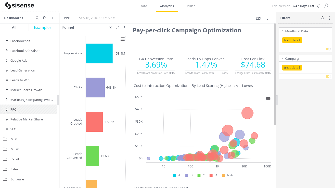
Here’s another dashboard from Sisense. This one helps you track your PPC Adwords campaigns.
You can view metrics like:
- Impressions
- Clicks
- Leads collected
- Leads converted to sales
- Opportunities won
- Google Adwords conversion rates and percentage change from the previous period
- Cost per click and percentage change from the previous period
- Bar and line trend chart showing leads converted and their relationship to cost over time
Sisense has many other example dashboards you can view by signing up for a Sisense free trial.
12. Online Marketing Dashboard (Boldbi)
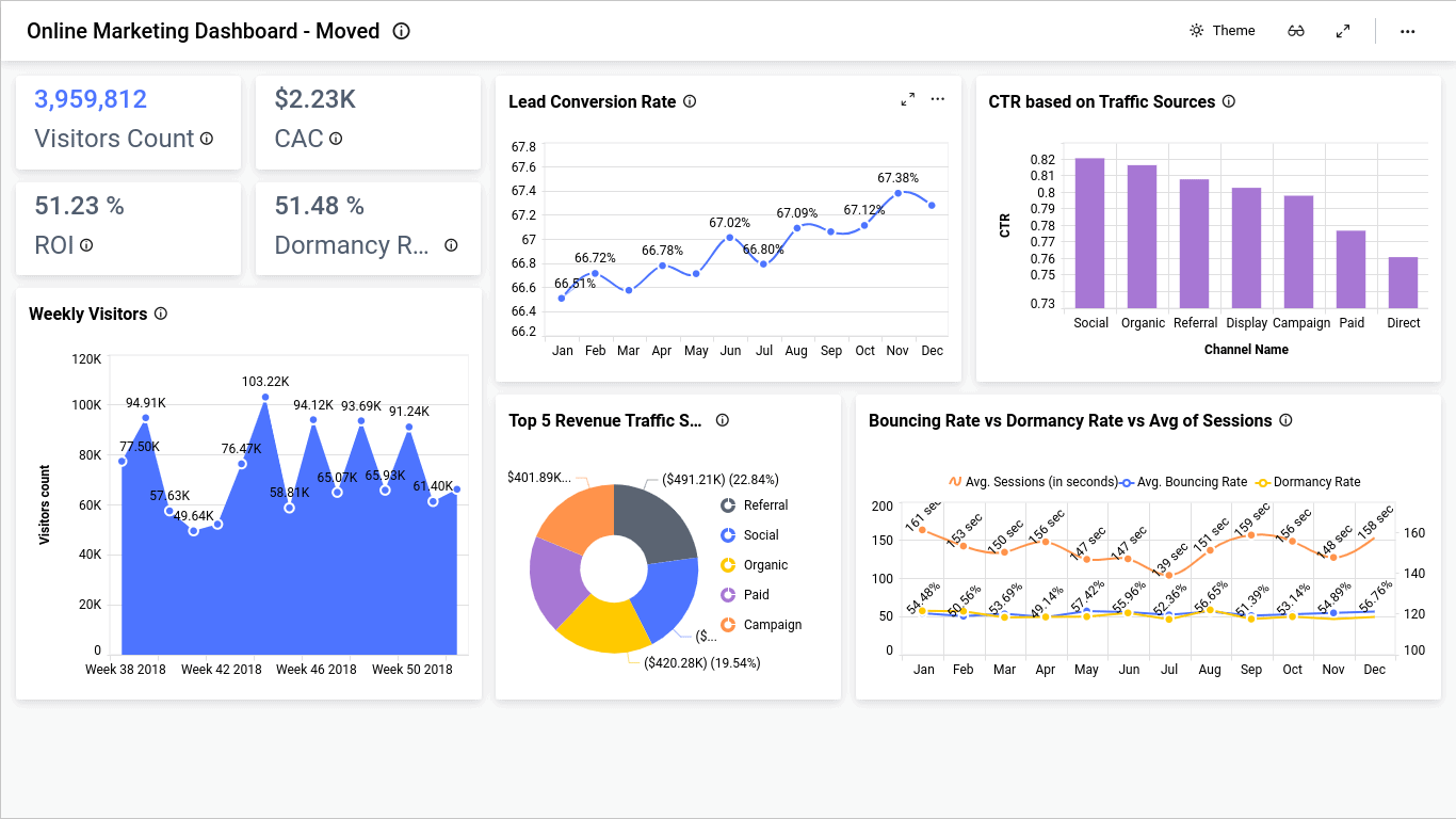
This online marketing overview dashboard example from Bolbi uses a white background and easy-to-read graphs and charts to show you important marketing data. Here are some of the metrics you can track using this dashboard:
- Total visitors
- Customer acquisition cost
- ROI
- Dormancy rate
- Weekly visitor graph
- Lead conversion rate graph over time
- Bar graph showing click-through rates based on traffic source (for example, social media click-through rate vs organic traffic)
- Top five traffic sources based on revenue
Also Read: Best Power BI Dashboard Examples
13. Website Visitor Analysis Dashboard (Boldbi)
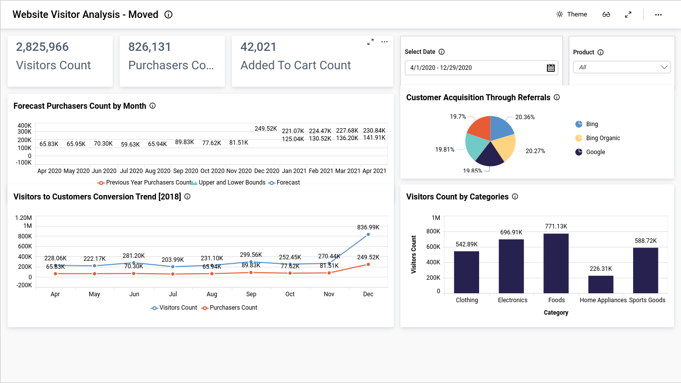
Here’s another Boldbi dashboard example. This one goes beyond analyzing the traffic coming to your website and also focuses on data relating to conversions and sales.
Here are some things you can see while viewing this dashboard:
- Total visitors
- Total purchasers
- How many people added products to their cart (usually more than actual purchasers)
- Customer acquisition breakdown by referral source
- Purchaser count forecast by month for the future
- Visitor to customer conversion trend graph
- Visitor count by product category (see which product categories are the most in-demand)
14. Executive Business Intelligence Dashboard (Inetsoft)
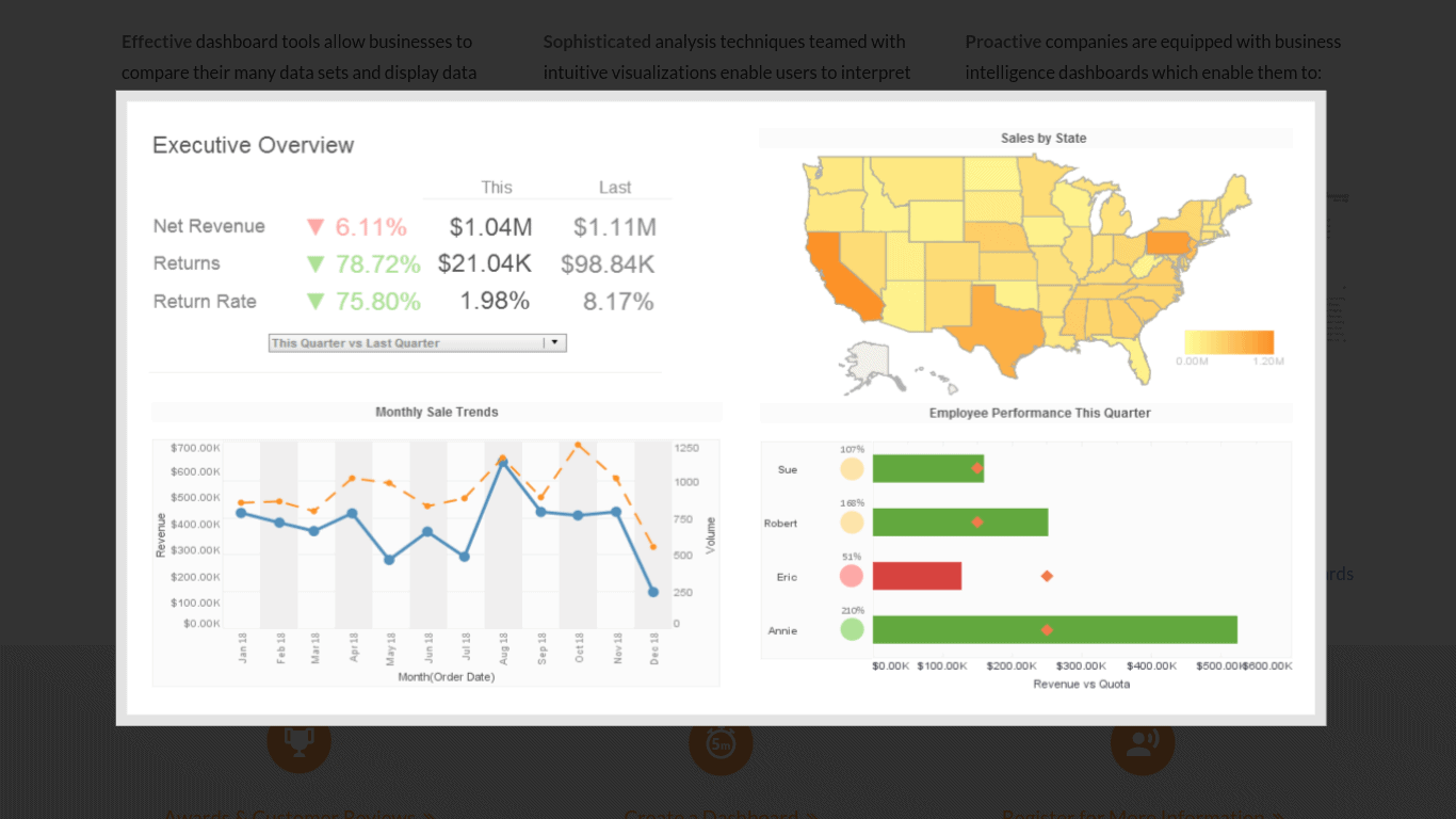
This executive business intelligence dashboard provides a quick overview of important metrics that might be of interest or importance to executives. You can see metrics like:
- Net revenue for this quarter vs last quarter and percentage change
- Returns for this quarter vs last quarter
- The return rate for this quarter vs last quarter
- Sales by state
- Employee performance bar chart
- Monthly sales trend graph
Explore: Best Jira Dashboard Examples
15. Health Center Overview (Tableau)
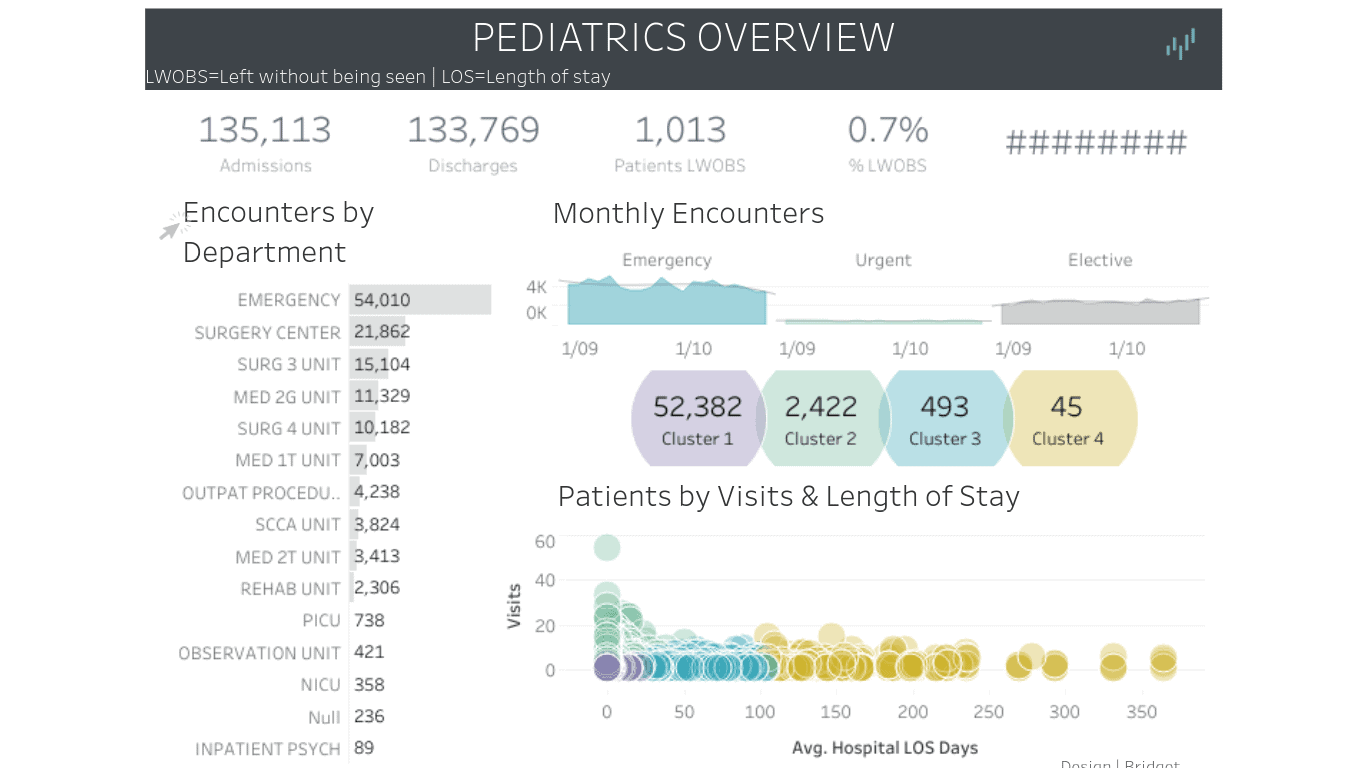
This dashboard is a perfect example of the kind of dashboard healthcare centers might use. If you run a private healthcare center, such as a private hospital or clinic, you can use this dashboard to track your performance.
Using this dashboard, you can view metrics like:
- Encounters by department (how many patients visited the emergency room, how many needed surgeries, etc.)
- Monthly encounter graphs for different departments
- Patient clusters by visits and lengths of stay
- Total admissions
- Total discharges
Private healthcare clinics and hospitals are businesses, too, so it is important to track these things. Even public healthcare clinics and hospitals should track such data, however.
16. Executive Dashboard (Vizion360)
This executive dashboard example by Vizion360 includes important data that might be of importance to executives, such as:
- Month to date sales
- Month to date net profits
- Month to date on hand amount
- Month to date production hours
- Productivity and efficiency rates
- Bookings, shipments, net sales, and goals per business day
- On hand amount per production facility
- Gross sales
Check Out: Best Tableau Retail Dashboard Examples
17. Sales Management Dashboard (Dundas Bi)
This sales management dashboard by Dundas Bi helps you track your sales performance. You can view metrics like:
- Total vs qualified leads
- Average conversions vs target conversions
- Conversion rates by salesperson, and whether they meet or fall below target conversion rates
- Average response time
- Outbound calls by salesperson, actual conversions made from calls by salesperson, and how they compare to the target
- Outbound emails by salesperson vs actual email conversions and target
- Meetings overview – booked, canceled, completed
I really liked this dashboard because it gives you detailed overviews of important metrics in an easy-to-understand manner. I really liked the way it uses graphs and charts to show the performance of each person on your sales team in particular.
18. Real Time Call Center Dashboard (Dundas Bi)
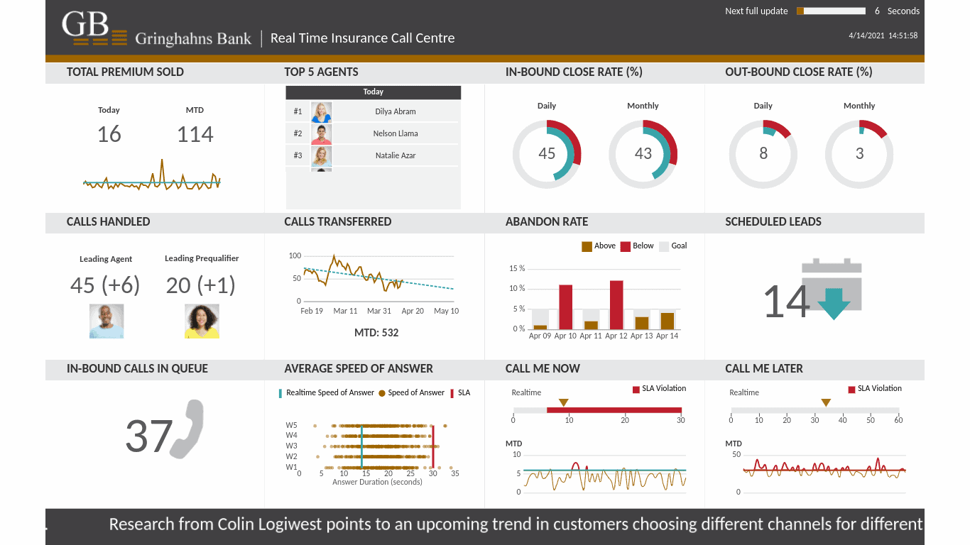
This call center dashboard helps you analyze the performance of your call center. Regardless of what you are selling, this dashboard can help you figure out where you are holding.
You can see metrics such as:
- Total premiums sold month to date
- Total premiums sold today
- Top five agents today by sales
- Inbound monthly and daily close rate (inbound calls)
- Outbound monthly and daily sales rate (outbound calls)
- Calls handled
- Calls transferred
- Abandon rate
- Scheduled calls
- Inbound calls in the queue right now
- Average answer speed
Explore: Best Tableau Sales Dashboard Examples
19. Brand Analytics And Market Research Dashboard (Datapine)
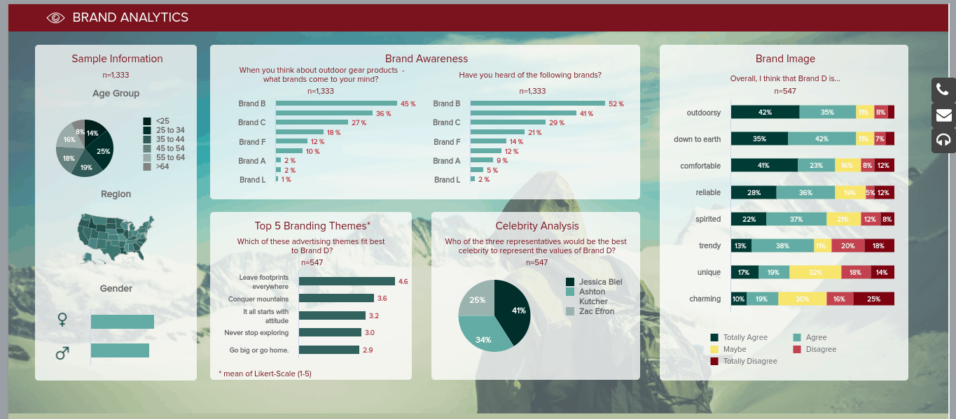
This dashboard is excellent for putting your market research data into one place. Market data is important for figuring out what consumers want and are looking for, but sometimes, it can be hard to put all the data you find into one place.
This dashboard lets you do that. It also helps you measure brand awareness.
You can view data such as:
- Which brands people think of when they think about a certain type of product
- How many people heard of specific brands
- The percentage of people who think a specific brand is trendy, charming, unique, etc. using metrics like totally agree, agree, maybe, disagree, totally disagree
- How many people believe certain celebrities would best represent a brand
- Demographics of survey respondents (location, age, gender)
20. Customer Analysis Dashboard (PowerBi)
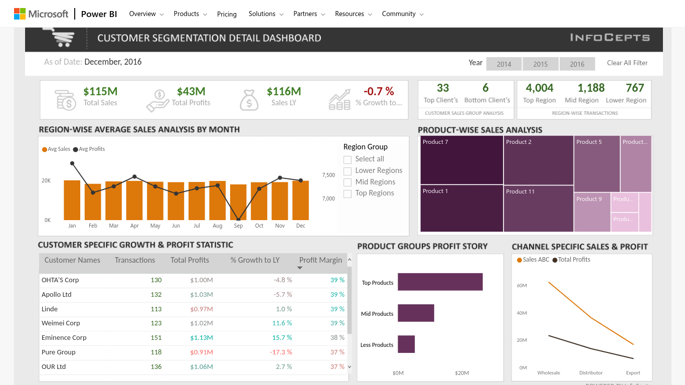
I haven’t yet included a PowerBi dashboard example, so here is one. This customer analysis dashboard lets you track metrics like:
- Total sales
- Total profits
- Number of top clients
- Number of bottom clients
- Region-wise sales analysis by month
- Product-wise sales analysis
- Customer breakdown – total transactions, sales, etc.
- Profit story – total profit breakdown by top vs middle vs bottom products
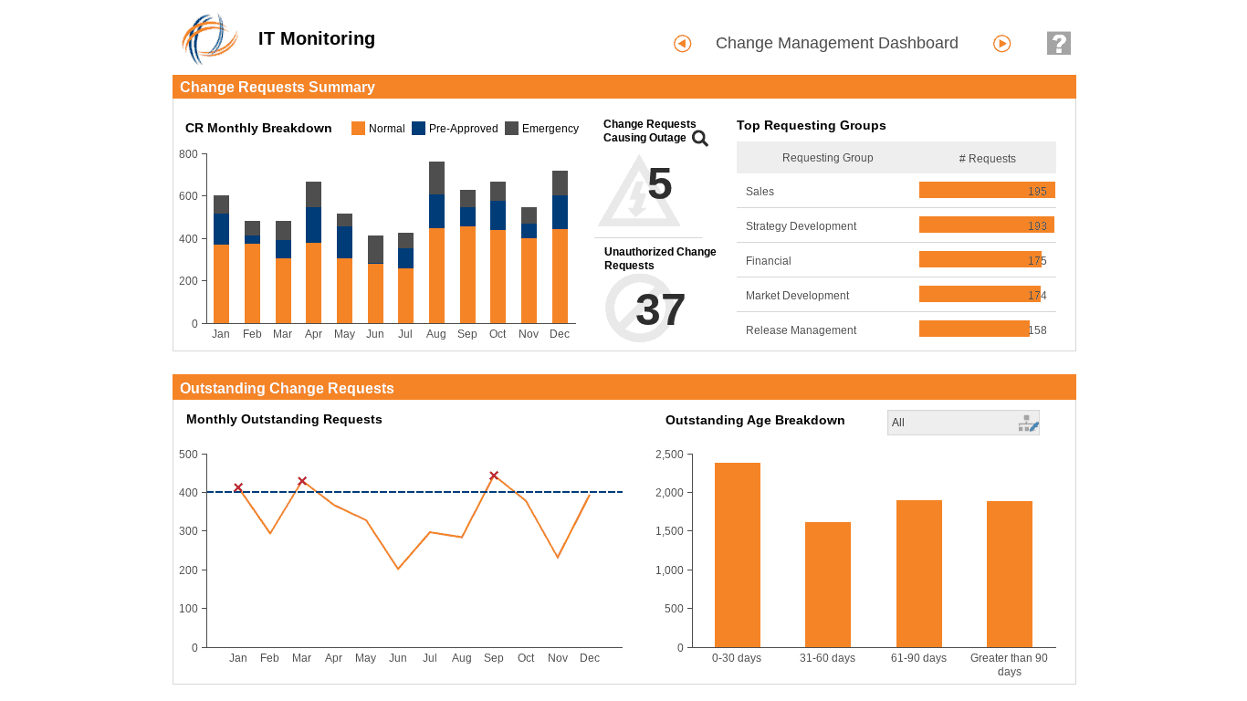
21. IT Operations Dashboard (Dundas Bi)
The IT operations dashboard can help your IT team track important metrics, such as which groups are creating IT requests.
Some of the things you can track using this dashboard include:
- Top requesting groups
- Change requests causing outages
- Unauthorized change requests
- Monthly outstanding requests chart
- Outstanding requests age breakdown
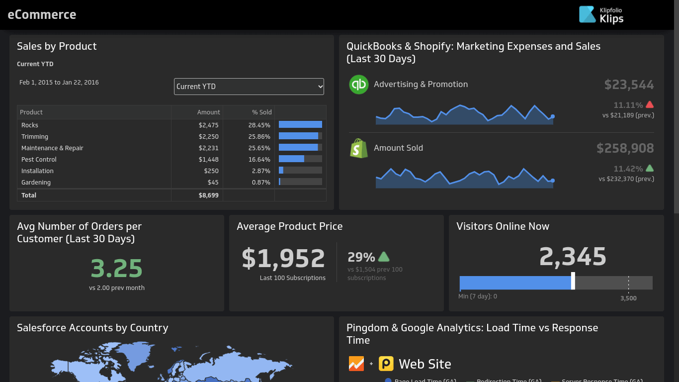
22. eCommerce Dashboard (Klipfolio)
Going back to Klipfolio dashboards, here is an awesome dashboard that breaks down your eCommerce performance. Using this dashboard, you can track your eCommerce store, including metrics like:
- Sales per product
- Percentage sold per product
- Quickbooks and Shopify marketing expenses and sales graph
- Average number of orders per customer this month and how it compares to the previous month
- Average product price per the last 100 sales or subscriptions and how it compares to the previous 100 sales or subscriptions
- How many visitors are online right now
- Pingdom stats – load time and response time
- Product page visits
- New customers
- Returning customers
- Average revenue per buyer
- Total transactions
- Total revenue
For the last few metrics, you can view that data for each of the previous few months and see how it went up or down.
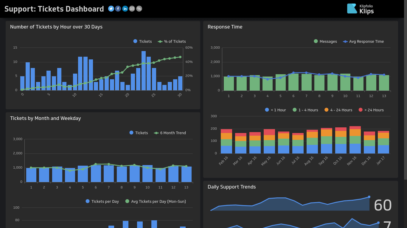
23. Support Tickets Dashboard (Klipfolio)
The support tickets dashboard example from Klipfolio helps you track support tickets submitted to your customer service team. You can view graphs and charts with metrics like:
- Number of tickets per hour and percentage of total tickets
- Response time
- Tickets by month and how they compare to the six-month trend
- Actual tickets per day vs tickets per day average
- Daily support trends
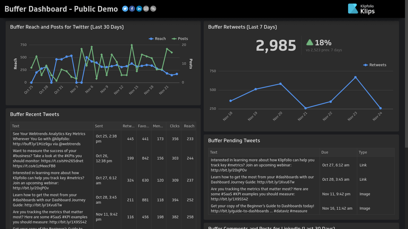
24. Buffer Dashboard (Klipfolio)
This dashboard provides data from Buffer. Buffer is a social media service that allows you to manage all of your social media channels from one place.
Using Buffer, you can publish posts on various social media channels, and you can also schedule posts to be published. Here are some of the things you can view using this dashboard:
- Line graph showing the number of Twitter posts, Twitter reach, and their relationship
- Total buffer retweets
- Buffer retweets line graph
- Recent tweets published through Buffer
- Future tweets scheduled to be published through Buffer
- Buffer comments and posts for sites like Facebook and LinkedIn
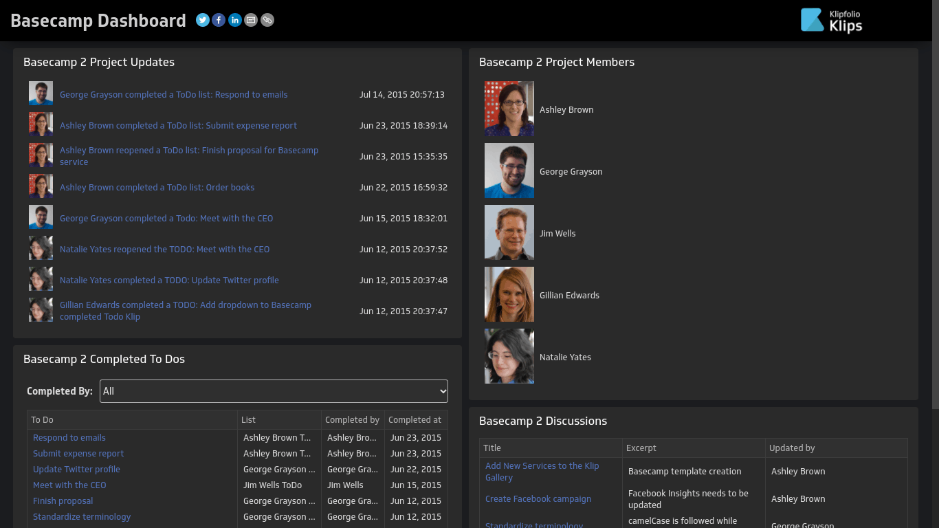
25. Basecamp Dashboard (Klipfolio)
Basecamp is a tool you can use for managing teams and projects. The Klipfolio Basecamp dashboard example shows you how to use a dashboard for the purpose of tracking a project you are managing via Basecamp.
You can view things like:
- Recent activity – people reopening tasks, completing tasks, etc.
- Recent discussions
- Project members
- Completed to-dos, completion date, who completed them, and more
Wrapping It Up
There are many more dashboard examples out there on the web. If you like a particular dashboard in this list, and you want to create a dashboard that looks exactly like it, click on the link to the dashboard.
You may be able to sign up to use that software and create a similar or lookalike dashboard.
Even if you are using another software, however, I hope that this list of dashboard examples serves as a source of inspiration for designing and setting up a dashboard, as well as deciding which data to include on the dashboard and how to present that data.

Benjamin Levin is a digital marketing professional with 4+ years of experience with inbound and outbound marketing. He helps small businesses reach their content creation, social media marketing, email marketing, and paid advertising goals. His hobbies include reading and traveling.


