Power BI Dashboards have innumerable uses. After all, data powers everything today, hence the need to understand it.
Dashboards help people understand data.
In one study, more than 87 percent of participants said preparing data was important, critical, or very important to them.

Business intelligence & data visualization tools like Tableau, Grafana, Qlikview and of course Power BI help companies to
- Analyze data from multiple sources
- Gain actionable insight that will drive business performance
In this post, we’ll talk about Power BI dashboards and its examples. Power BI is an excellent business intelligence tool from Microsoft. The tool delivers critical insights for reputable brands such as Adobe, Heathrow, GE Healthcare, and more.
With its broad range of intuitive and interactive dashboards, users can turn data from Excel, on-premise, and cloud-based data warehouses into visually immersive insights.
Power BI dashboard allows managers to
- Discover what’s important
- Tell stories and share them with team members
- Make data-driven business decisions
Let’s explore the 15 best Power BI dashboard examples.
Best Power BI Dashboard Examples
1. Airport Authority Performance Dashboard

The Airport Authority Performance Dashboard gives a clear and user-centric view of all critical data. Airport management authorities can use quickly make data-driven decisions where there are
- Flight changes
- Emergencies
- Delays
What this Dashboard Does
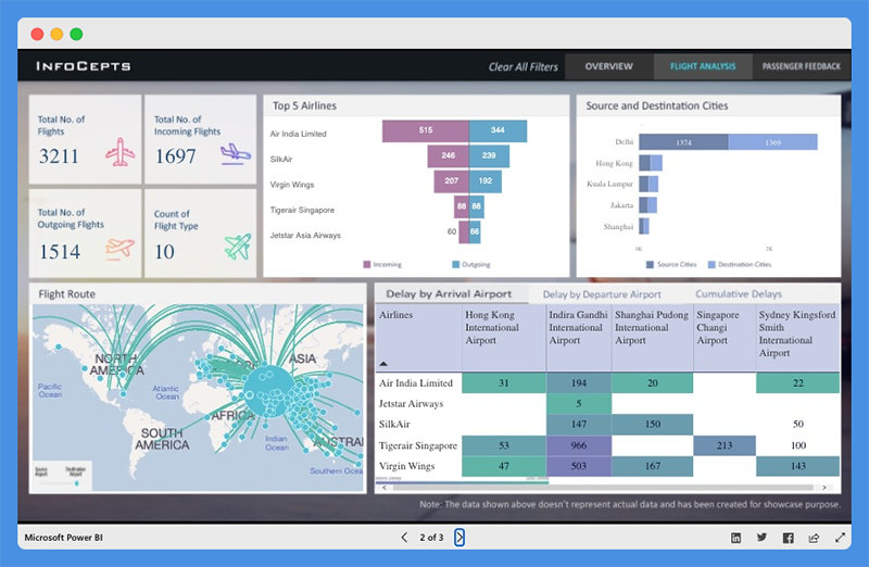
This dashboard overview offers quick insight into critical metrics including
- Total flights (incoming and outgoing flights)
- Total delays (arrivals and departures)
- Ground handling time – Queuing, Processing, and Clearance time
- Passengers satisfaction index
With this dashboard, users can study the most popular flight routes, the top five airlines, for incoming and outgoing flights. The dashboard also provides data about the source and destination cities of major airliners.

This dashboard features a passenger feedback section and offers an insight into the
- Number of passengers by gender and age group
- Top Nationality
- Satisfaction experience based on terminal and month
- Total satisfaction count and more
This Power BI dashboard can help airport management
- Evaluate operational processes
- Discover bottlenecks
- Identify areas for improvement
People’s Response to This Dashboard
- This dashboard offers detailed insight into airport operations activities.
- Page backgrounds are incredible.
Explore: Best Tableau Courses
2. Customer Analysis Dashboard
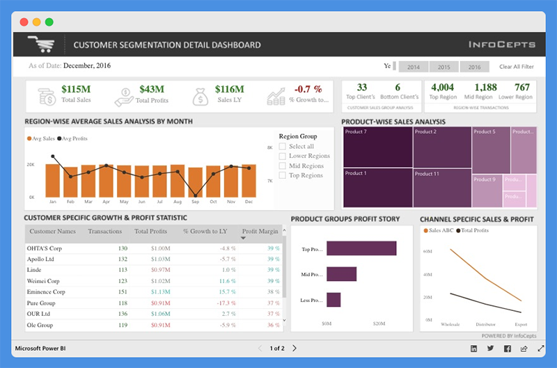
The Customer Analysis Dashboard offers valuable insight into product sales and profit for regional customers. Managers and business leaders can use this Power BI dashboard to analyze business growth across regions.
They can evaluate profit distribution across customers, make valuable decisions to increase revenue, and drive profitability.
What this Dashboard Does
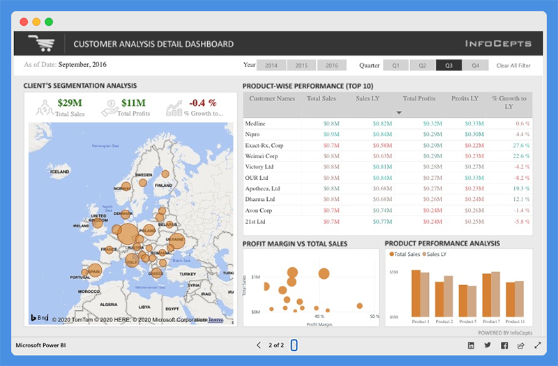
This dashboard provides details about total sales, total profits, last year sales, and percentage growth. You can use the filters to view data for different years. With this dashboard, managers can gain insight into
- Product-wise sales analysis
- Customer-specific growth and profit statistics
- Channel specific sales and profits
Customers can use charts to
- Compare total sales and profit margins
- Analyze client segmentation and product performance
People’s Response to This Dashboard
- The icons and color combinations are excellent
- The dashboard is useful for sales and marketing teams
You Might Want To Read: Best Tableau Sales Dashboard Examples
3. Global Superstore Dashboard
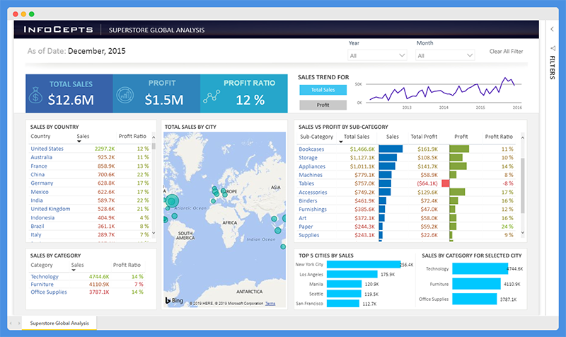
The Global Superstore Dashboard offers a 360-degree picture of overall sales performance. Managers can use this Power BI dashboard to set performance targets, track KPIs, and measure results.
What this Dashboard Does
The dashboard has a single-screen display and offers actionable insights into key elements. Users can view detailed analyses and information including
- Total sales, profit, and profit ratio
- Sales by country
- Sales by category and subcategory
- Total sales by city and more
People’s Response to This Dashboard
- This Power BI dashboard highlights critical information.
- The dashboard is clean, easy to read, and offers powerful insights.
Worth Reading: Best Tableau Retail Dashboard Examples
4. Cancer Analytics Dashboard
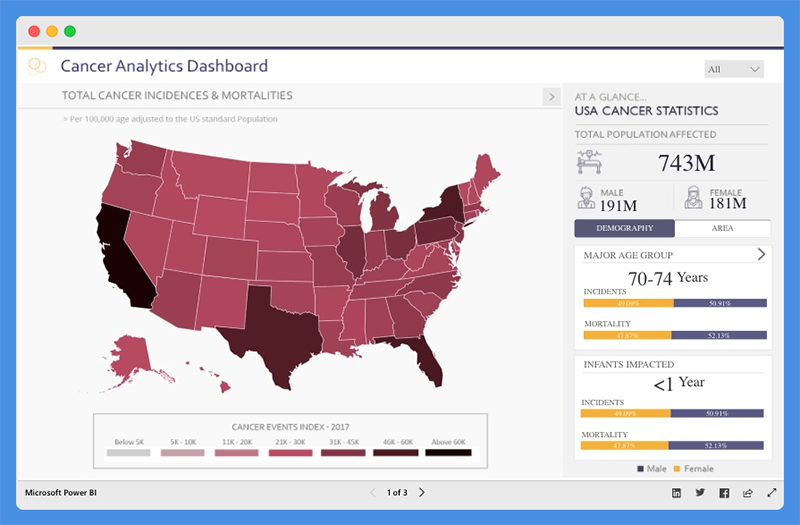
This Power BI dashboard tells a story about cancer patients in the USA. With this dashboard, health agencies can
- Make informed decisions
- Establish policies to manage cases and track recoveries
What this Dashboard Does
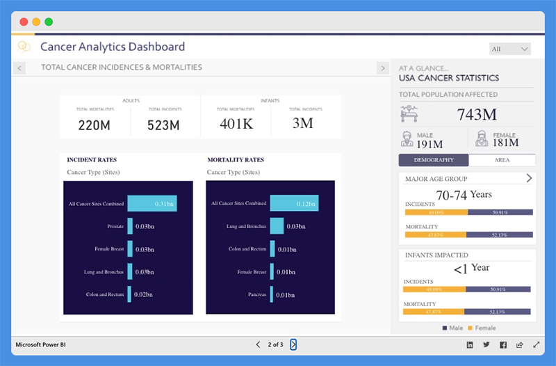
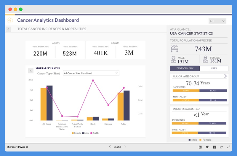
The Cancer Analytics dashboard shows total cancer incidences and mortalities. Users can view the total population affected, and the numbers of people affected based on demography and area.
The dashboard helps you understand the incidences and mortality rates associated with each cancer type. You can hover over any state to find out the number of affected victims.
People’s Response to This Dashboard
- The dashboard is intuitive and visually appealing.
- It provides valuable data for government use.
5. Pharma Sales Analysis Dashboard
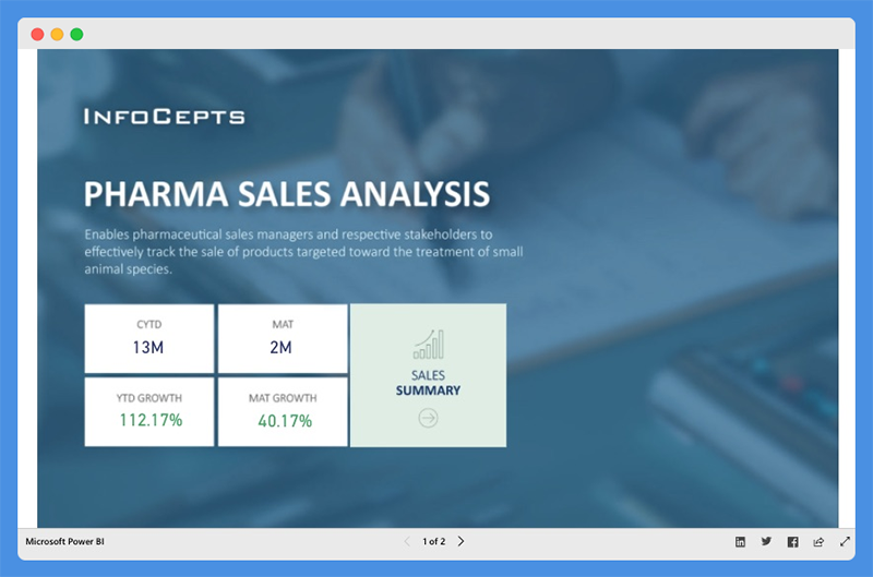
The Pharma Sales Analysis Dashboard provides an overview of sales for veterinary products. Veterinary professionals can use this chart to track the sale of products used to treat small animal species.
What this Dashboard Does
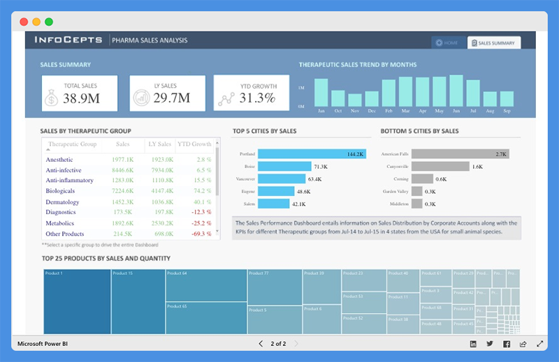
With this dashboard, users can analyze product sales for the Top Five Cities and the Bottom Five Cities. Users can view extensive reports on
- Sales by Therapeutic Group
- Top 25 Products by Sales and Quantity
- Therapeutic Sales Trends across any given period
People’s Response to This Dashboard
- The dashboard has cool visualizations and offers profound insights.
- Data is visible and arranged.
6. HR Analytics Dashboard

The HR Analytics Dashboard offers a bird’s eye view of a company’s human resource metrics including
- Headcount statistics
- Financial statistics
- Demographic statistics
- Employee details
With this dashboard, organizations can make critical decisions to drive employee productivity.
What this Dashboard Does
This Power BI dashboard provides insight into headcount statistics. Under this tab, managers can view

- Total Headcount
- Active Employees
- New Joiners
- Attrition Rate
- Satisfaction Score by Employee
- Attrition Rate by Education, Salary, and Experience
The dashboard offers additional insight into demographic statistics including

- Employee by Location and Demography
- Quarterly Employee Headcounts by Departments
- Total Absenteeism by Department and Leave Type
The chart offers an accurate representation of the firm’s finances in terms of

- Cost to Company (CPC),
- Company Cost by Division and Departments
- Compensation, Salary, Bonus, Overtime, and more
It also gives an overview of each employee, including

- Performance ratings
- Annual leave report
- Personal information
- Financial details
- Current position
- Absenteeism report
People’s Response to This Dashboard
- Reports and visualizations are pixel perfect.
- The dashboard color theme is visually appealing.
7. Executive Insights Dashboard

This Power BI intelligence dashboard sheds light on business health and performance. Companies can use this dashboard to explore company-wide data for decision making.
What this Dashboard Does
The Executive Insights dashboard allows companies to view their business from multiple angles based on attributes including
- Products
- Year
- Country
- Order type
The dashboard leverages line charts, donut charts, and custom visuals for analysis. Companies can use filters to tell stories about business elements, like total profit, quantity, and revenue. Users can gain insight into metrics such as
- Profit margin
- Average order quantity
- YOY percentage change in Total Profit
- Top five products by Total Profit, Total Quantity, and Total Revenue
- How Total Profit, Total Quantity, and Total Revenue is distributed geographically
The tool allows users to dig deeper and view company performance based on specific product types.
People’s Response to This Dashboard
- The dashboard offers next-level user interactivity and attractive mapping.
- Clear and easy to understand
8. Inventory Stock Analysis Dashboard

The Inventory Stock Analysis Dashboard provides a clear view of the company’s inventory for the year 2018. Companies can track stock availability and replenish them at the right time.
What this Dashboard Does
The dashboard is broadly categorized into:
- Product Categories by Customer Views and Inventory
- Category Selection – Men’s clothing and Women’s Clothing
- Quarters – First, second, and third quarters
Product Categories by Views are further classified into
- Most Viewed
- Least Viewed
- Products Not Viewed
You can also view Total Sales in USD and percentage-based classification. Product Categories by Inventory are classified into
- In Stock
- Running Out Of Stock
- Out of Stock
For each category, the top five products, number of views, days’ supply, and replenishment days are clearly outlined.
This dashboard also offers insights on Inventory. It divides the top five products into individual categories and segments them into Overall Percentage and Total Sales.
The dashboard offers a stock prediction section. Users can select product subcategories and get data on Average Daily Sales, Replenishment Days, and Days Out of Stock.
You can predict Time to Replenish Stock and Stock Availability based on factors like MarkDown Variance and Fulfillment Cycle.
People’s Response to This Dashboard
- The dashboard is intuitive and covers multiple sections.
9. Electricity Energy Usage and Cost Dashboard

This Power BI dashboard helps users to estimate the electrical energy they utilize from home appliances. Users can view critical insights about United States Electricity Supply and Cost.
With this dashboard, users can monitor their power consumption and take proactive steps to reduce costs.
What this Dashboard Does

Users can calculate their usage by selecting the appliances they use and how much time they use per day. Then they can choose their state or location to estimate the cost of their electricity bill. The dashboard showcases the following
- Total Annual Energy (kWh)
- Total Annual Cost ($)
- Annual Costs by Category or Appliance
- Annual Energy by Appliance

This dashboard gives users a birds-eye view of
- Total Electricity Sales by Sector
- Count of Plants by Sources, Prime Movers, and Energy Group
People’s Response to This Dashboard
- The dashboard provides useful information for everyday use.
- Presentation is accurate and easy to understand
10. Sales Scorecard Dashboard

The Sales Scorecard dashboard helps organizations answer critical questions about sales performance. This dashboard leverages Power BI elements, including shapes, cards, treemaps, and DAX, to build KPIs that provide enough details to help sales managers take action.
What this Dashboard Does
This dashboard provides vital insight into how much companies are selling per state, region, and product. You can view comparisons of sales and profit against the previous years to put sales performance into perspective.
Managers can view the cost components of the business that are driving profits or losses. Also, they can filter the dashboard based on year and business segments.
People’s Response to This Dashboard
- The dashboard is interactive and easy to understand.
- The chart helps sales teams answer important questions.
11. Social Media Monitoring & Analytics Dashboard

This Power BI dashboard is great for marketers, managers, and agencies. With the Social Media Monitoring and Analytics tool, you can improve sales, product quality, and crisis control. The tool helps organizations understand the audience’s opinion about their product.
What this Dashboard Does
This dashboard shows monthly data focuses on aspects of social media including
- Discussion Intensity
- Web Sources
- Sentiment Analysis
- Online Influencers
- Special Categories
- Quotes and Geolocation
The Discussion Intensity tab offers critical insight into total reach, mentions on social media, and beyond social media. The chart also shows influencers by volume and impact, amplification, and true reach.
The sentiment analysis highlights User’s Mentions by Day, Hour, and Total mentions. Users can also view the percentage of negative, positive, and neutral mentions.

Web sources show the channels from which the mentions emanated, including

- Blogs
- Photos
- Videos
With this dashboard, users can view positive and negative mentions based on geolocation, including regions and cities.

Under the online influencer section, you’ll find influencers broken down by volume and impact across the months of the year. It also shows a breakdown of the influencer’s follower numbers impact, whether it’s negative, positive, or neutral.

People’s Response to This Dashboard
- The dashboard is stunning and offers critical insight.
- Beautiful dashboard design
12. Attendance Tracker Dashboard

The Attendance Tracker Dashboard helps school administrators track attendance across different teachers, classes, and schools.
This dashboard will drive critical conversations and increased engagement between key stakeholders. With the reports from this dashboard, stakeholders can increase attendance and improve performance in the educational sector.
What this Dashboard Does
The dashboard shows the Absence Percentage by Subject, Courses, Period, and Day. Users can gain insight into the percentage of Actual and Target Absence, Total Absences, and Target Absences.
The District Status section provides high-level insight into attendance trends and goals. The line chart highlights Actuals compared to Target over time. Plus, the chart offers a predicted range for future months.
The chart also shows data about Opportunities by School. This section will help administrators target the most critical schools to work with. The most critical schools have the highest opportunity for Absence Reduction.
The Conversation Topics section provides insight into relevant information such as subject, course, period, and days of the week. With this data, school administrators can reach out to teachers on an individual basis and increase educational value.
People’s Response to This Dashboard
- Excellent and Insightful dashboard for teachers and administrators.
- The dashboard provides insight at a district level to create action and development plans for teachers, schools, and specific periods and subjects.
13. Team Performance vs. Target Dashboard

The Team Performance vs. Target dashboard highlights the performance level against set targets for business teams.
With the insight from this dashboard, business leaders can share targets with teams daily, and evaluate how they score against their goal. Managers can uncover areas for improvement and require more push, products, and customers that sales teams should focus on.
This Power BI dashboard shows you the targets and bonuses that are within reach. It uses drill-throughs and bookmarks to organize the content.
Users can move fluently between pages, switch between visuals using toggle) and drill down on Sales Reps, Products, and Customers.
What this Dashboard Does

The first page of the dashboard shows the percentage of YTD Results Vs. Target. You can click on a team member’s photo to view their Sales Rep Bookmark.
For each sales rep, you can select metrics (Units or Profits). Also, you can select Period to analyze and understand long and short term trends.
Also, the dashboard allows users to switch between Bar and Map visuals using the toggle image, view non-profitable customers, and more.

Users can compare Performance and Target Cumulative Variance for all customers. You can right-click on the bar chart to open Customer Bookmark and drill through customers.
This dashboard shows you profit, average price, and average margin within a location. Users can switch between Scatter and Matrix visuals using Toggle and identify product and sales opportunities within customers.
People’s Response to This Dashboard
- The visualizations are innovative and well-customized.
- The dashboard is easy to understand.
14. NFL Fantasy Football Player Comparison Dashboard

This Power BI dashboard helps users prepare their fantasy draft for the new NFL season. The dashboard draws its data from the NFL Fantasy Football player projection and the NFL player stats. Games and NFL enthusiasts use this dashboard to make accurate predictions and secure winnings.
What this Dashboard Does
You can use this Fantasy football player comparison tool by selecting player one and player two from the lists provided. The report allows users to compare players by viewing critical players’ stats. You can view stats including
- Total fantasy points for the previous season
- Projected receptions
- Yards and touchdowns for the upcoming season
- Current season’s NFL.com predicted points total
The dashboard includes “What Ifs” to allow the user to create their player projections. Under the sections ‘Calculate Your Projection,’ you can adjust the selected player’s receptions, touchdowns, and yards numbers to see how it will impact their overall fantasy points. The scoring for this dashboard is based on the standard NFL.com fantasy scoring system.
Furthermore, this dashboard includes an option for PPR (points per reception) leagues. If your league is a PPR league, you can select ‘Yes’ in the top left corner. The overall points calculation will take into account the added points for each of the player’s receptions.
People’s Response to This Dashboard
- Fantastic dashboard design layout
- Excellent use of the player images
15. Seattle’s Construction Climate Dashboard

This Power BI dashboard visually captures and presents the growth of Seattle’s Construction industry. The dashboard is powered by data from the Seattle Building Permits dataset.
The building permit data offers profound insight and paints a clear picture of industry growth. It also provides a sneak preview into the future of Seattle’s construction climate.
This dashboard is valuable for
- Construction salespeople researching prospective sites
- Contractors investigating the competition’s strategy
- Managers and CEOs that are making critical decisions on how to pivot their business
Seattle’s Construction Climate dashboard provides a deeper understanding of the market. Also, it enables you to drill down into major details and research specific events.
What this Dashboard Does
This dashboard is divided into three tabs. These tabs provide answers to critical questions.
For the Building Climate Overview Tab
- The top bar chart shows the increase in pace and amount of investment with time.
- The map highlights the investment concentration in specific locations. It also shows how the concentration is affected by Individual, Contractor, or Category.
- The Highlighted Metrics section provides insight into market status. It shows the Permit Count, Total Value, Average Permit Value, and Maximum Permit Value.
- The Middle Bar Chart shows categories that have the highest breakout. It also displays the individuals with the Largest Sum Value and Permits leading the market.
Contractor Competition Tab

- The top line charts show the trending deal amounts and frequencies.
- The middle bar charts show contractors that are winning the most deals. It also shows which contractors have the highest Total Sum of Deals. You can also see which contractors are leading the market based on size, quantity, size, value
Category Growth Tab

- The left bar chart showcases the Total Value of Permit, Total Count of Permits, and Average Permit Value for each category.
- The line chart shows which category at the fastest rate and total Value growth trend and permit status.
- The right bar chart shows the status of most permits.
This dashboard is easy to operate. You can select the parameters that fit your situation. Also, you can adjust the time frame using the top slider bar.
Dashboard Filterable Fields
The filterable fields in this dashboard include the
- Permit Status – Application, review, and inspection lifecycle
- Permit Type – This refers to Activities covered by the permit (Construction, Site Development, and Demolition)
- Category – Industrial, Commercial, Institutional, Single Family or Duplex, and Multifamily
- Contractors associated with a permit
People’s Response to This Dashboard
- The dashboard shifts the focus from data complexities to the design elements and visual flow.
- The dashboard is attractive, intuitive, and easy to understand.
- Users can easily find critical insights and make decisions quickly.
Wrap Up
We have reviewed some of the best Power BI dashboard examples. Power BI dashboard cuts across multiple industries and can be used for several purposes.
Business leaders use this tool to track sales and marketing, KPIs, human resource analytics, inventory, and more. Power BI allows users to connect to multiple data sources and analyze their data.
Business teams can collaborate on the same data, reports, and share insights across Microsoft Office applications such as Microsoft Excel and Teams. Users can promote insights across the organization while maintaining data consistency, accuracy, and security.
With intuitive dashboards and reports, businesses can visualize their data and uncover deep insights. The dashboard provides insights into business performance and answers to business questions.
You should use Power BI dashboards to make data-driven decisions that will put your business in the driver’s seat.

Nicholas Godwin helps businesses tell profitable brand stories that their audiences love. He’s worked on projects for Fortune 500 companies, global tech corporations and top consulting firms, from Bloomberg Beta, Accenture, PwC, and Deloitte to HP, Shell, and AT&T. Works with Mofluid these days.